From idea to reality: How we developed the case builder
Jun 01, 2023
•
10 min
•
Sep 30, 2025

Written by: Anastasia Kondratenko
Every designer has surely faced this problem: doing the same repetitive and boring tasks that take up a lot of time.
We know exactly how it feels because we spent a lot of time and effort creating cases in Tilda. Unfortunately, we weren't happy with the outcome: the layout would break when we exported it, making our projects look messy.
We found a solution! In this article, I will tell you all about how we created our case builder. It is made up of 12 customizable blocks that automatically adjust to different devices. This allowed us to streamline the process and move away from Tilda.
I will share all the details of how we did it. If you are a designer looking for effective ways to improve your workflow, this article is perfect for you. 🚀
How it all began
Zero block in Tilda
Most of our projects were created in Tilda using standard templates. However, as time went on, we started utilizing the zero block more frequently. This editor allows us to design from scratch according to our vision. At first, we would design the layouts in Figma and then transfer them to Tilda. But using our templates ended up being time-consuming. Whenever we had to change the amount of text, for example, we had to fix the spacing and styles. The reason for this was the absolute positioning, the shortcomings of which we experienced to the fullest! 😄
Export from Tilda
In March 2022, we updated our website with a clean and simple design that includes large images with parallax effects. Since we used Tilda to create our projects, we needed to add them to the website. However, after exporting them, we faced some issues with how the content appeared. The images loaded slowly or didn't show up at all, and the text and images overlapped each other. We had to refresh the page multiple times to see the content correctly, which was frustrating. 😢
Unfortunately, the limitations of Tilda prevented us from fully fixing these problems.
New site
Since we didn't have clear design guidelines, the design ended up being inconsistent. The cases didn't match the style of our new website, which made the user experience less consistent and enjoyable.
Our expectations
Based on the information provided, we were looking for a solution that would:
- Save time when creating cases;
- Allow us to reuse blocks without additional formatting;
- Easily create designs that adapt to different devices;
- Make each case unique while still fitting the overall site style;
- Simplify the process for new employees;
Our solution
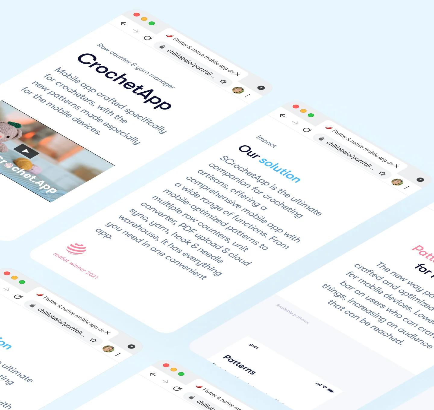
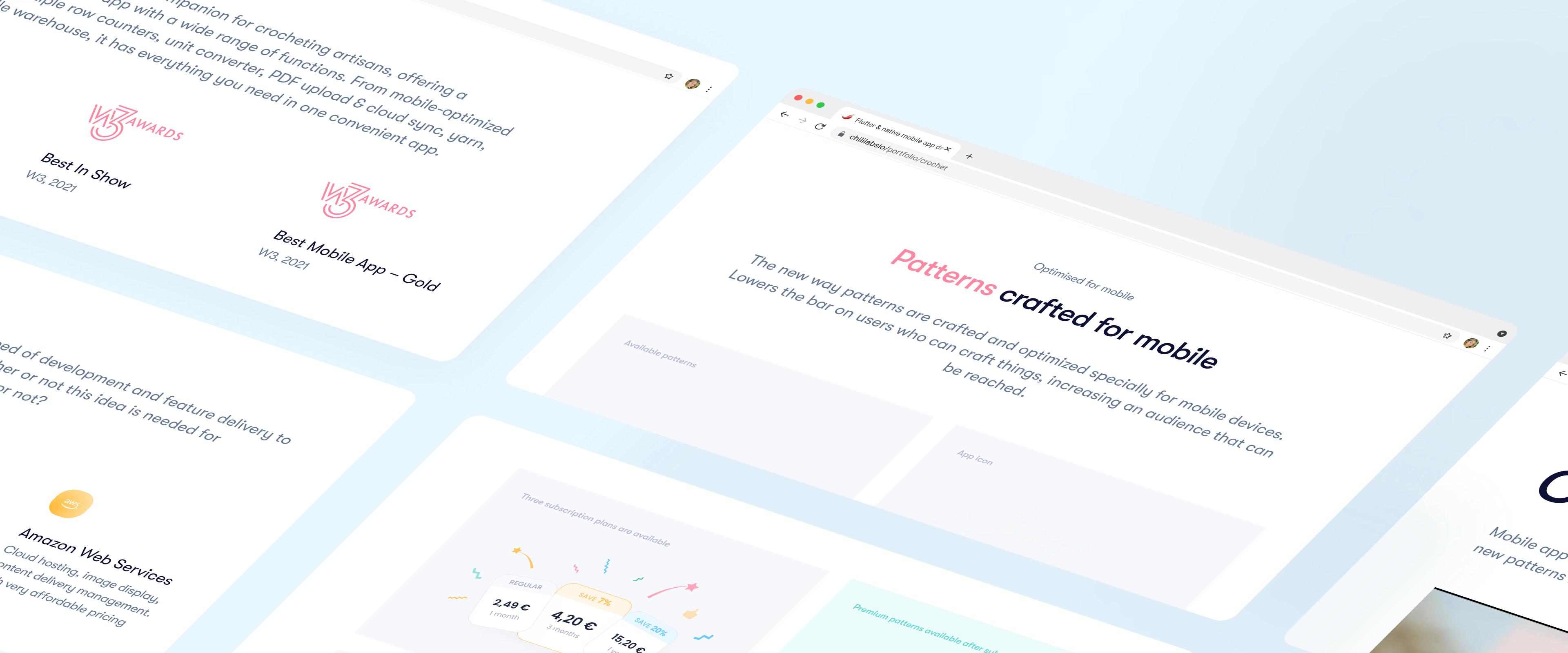
After analyzing the cases, we identified 12 unique blocks:
-
"About the project" - provide information about the project itself, including its ideas and goals.
-
"Our Role" - explain our role in the project.
-
"Results of Work" - show the outcomes and achievements of our work.
-
"Carousel" - a decorative block with attractive animation.
-
"Separator" - a smooth transition that helps users move between different sections.
-
"Big picture and text" - displays interesting design solutions.
-
"List of clients/awards" - highlight our clients and any awards we have received.
-
"Additional information about the project" - provide more detailed information about the project or specific aspects of it.
-
"Technologies Used" - list the technologies and tools employed, including programming languages, frameworks, and services.
-
"Workflow" - describe the step-by-step process involved in executing the project.
-
"Before/after comparison slider" - a visual tool that demonstrates the improvements made.
-
"Links to the application" - provide direct links for users to explore the application further.
What about being creative?
We want to make sure that standardized cases don't look boring and the same. That's why we've added customization options. You can now personalize the number and size of images, align text, position content, and choose which features to include or exclude
In the end, we have:
- Adaptive templates with a design system in Figma;
- Detailed documentation;
- Templates for CMS.
Seeing once is better than hearing a hundred times!
I invite you to take a look at several cases we have already completed using our builder:
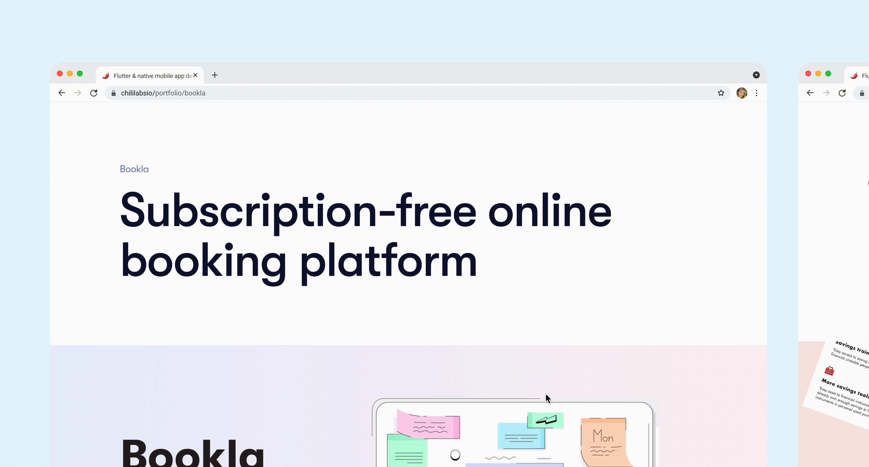
- 📚 Bookla
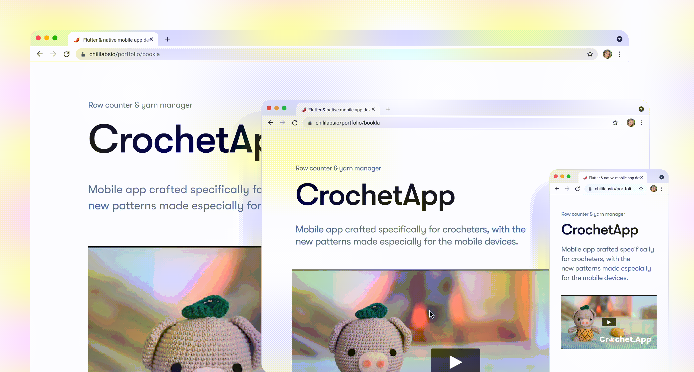
- 🧶 Crochet App
- 🎥 Sora Stream
Thank you for investing your time and reading until the end. It means a lot to me, as this is my debut article, and I'm glad it has been helpful to you.
Nastya 🤍
