Digital Design 101: From UX UI Terms to Real-World Examples
May 26, 2026
•
15 min
•
May 26, 2026

Written by: Alans Romanovs
Job Title•Marketing Specialist @ Chili Labs

Co-author: Snezhana Ivankovich
Understanding the terminology:
IA, IxD, UX & UI
In digital product development, acronyms like IA, IxD, UX & UI are used constantly. It’s clear that each represents a different part of the design process, but what exactly sets them apart?
In this article, we’ll break down what each term means and share some of the Chili Labs design expertise through two different app examples.
TL;DR table
Let’s take a closer look at the terms we’ll be covering today. Understanding the differences between them is the first step to creating better product design.
| Term | Stands for | Focus |
|---|---|---|
| UX | User experience | The overall feeling and quality of experience users have while using the product |
| UI | User interface | The visual design users see and interact with |
| IA | Information architecture | How content and features are organized and structured |
| IxD | Interaction design | How the interface responds to user actions and interactions |
User Experience (UX)
UX focuses on the overall experience users have while interacting with a product. Its purpose is to make actions simple, intuitive, and frustration-free, helping users achieve their goals with minimal effort. This is why having a skilled UX UI designer is critical to the process.
User Interface (UI)
UI is the visual side of the product: colors, typography, buttons, spacing, icons and layouts. It shapes how the product looks and how easy it is to visually understand and use. When thinking about the true UX and UI meaning, remember that UI acts as the bridge between the user and the digital environment.
Information Architecture (IA)
IA defines how content and features are organized inside a product. It helps users understand where things are and how to navigate in the app without getting lost.
Interaction Design (IxD)
IxD defines how the interface behaves when users interact with it. It covers things like animations, transitions, button states and swipe actions. In general, it focuses on feedback that makes the app feel responsive and interactive.
Although these terms are closely connected, each one solves a different problem. A strong digital product requires all of them working together: clear structure, intuitive flows, appealing visuals, and responsive interactions. Ignoring even one of these areas can make the product harder to use. That’s why balancing them is one of the core UI UX designer job responsibilities.
Theory meets real scenarios
Mobile app design is fundamentally different from desktop. Screen space is limited, user attention is short, and every interaction needs to feel fast, natural and effortless. When designing mobile applications, even the smallest decisions can directly affect usability. Every layout choice, tap target and navigation element must serve a clear purpose.
At Chili Labs, mobile design goes far beyond making interfaces look good. Modern users expect apps to feel intuitive, responsive, and comfortable in everyday use. That’s why our mobile app design services focus heavily on usability, interactions and creating experiences that feel natural in the user’s hand. The following examples demonstrate how these principles are applied when you thoughtfully design mobile app interface flows.
The Devil is in the Details: 2023 vs 2026
Mobile design evolves fast. To demonstrate how quickly standards and user expectations change, we compared the same functional screen designed by Chili Labs in 2023 with a modernized 2026 approach. While both versions solve the same task, the visual structure and interactions clearly show how mobile app UI design have evolved.
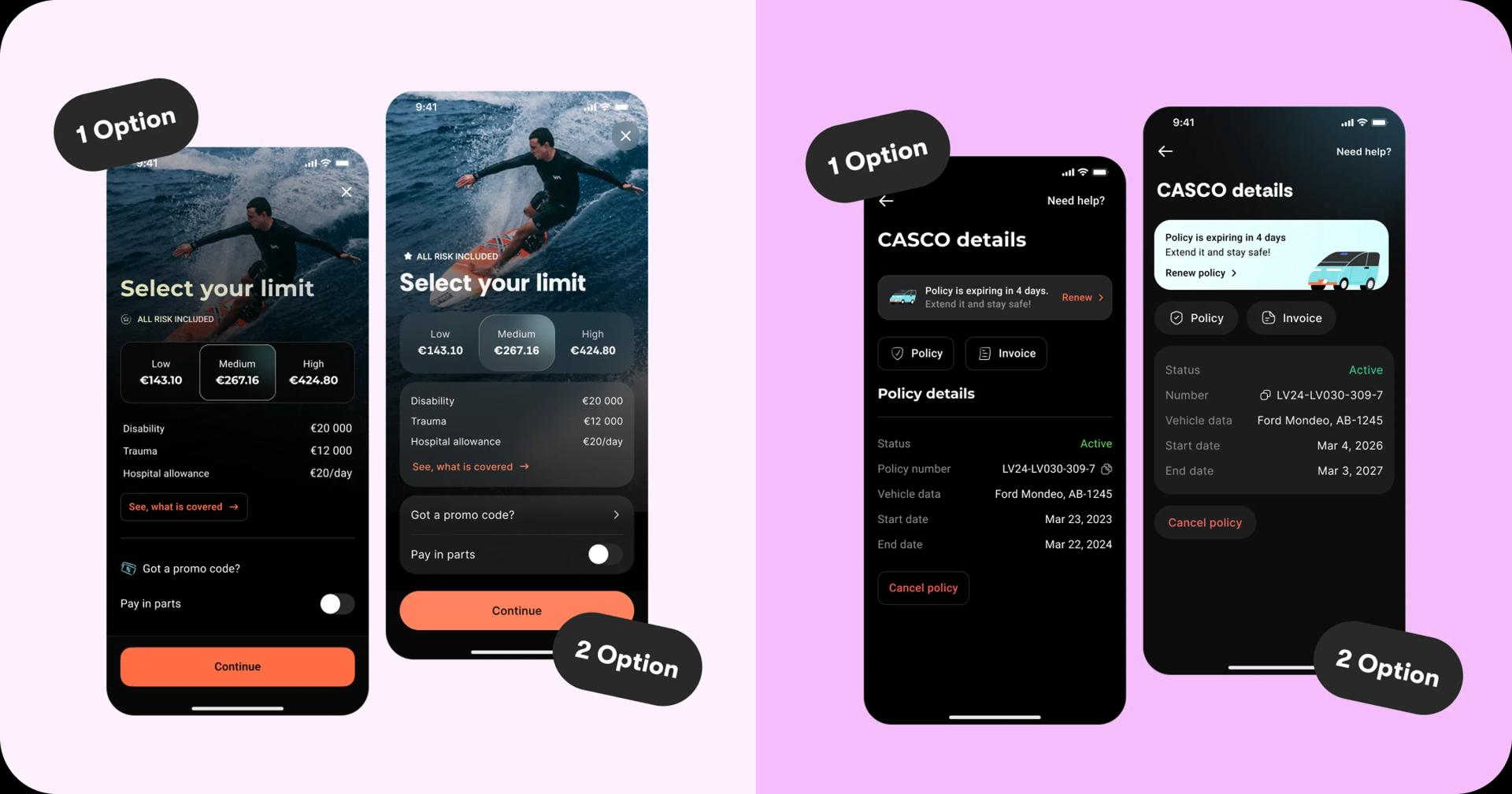 The 2023 approach (Option 1)
The 2023 version follows a more traditional mobile layout. Information is stacked in a linear vertical structure separated by simple dividers and standard full-width elements. The design is functional and easy to understand, but it relies heavily on sequential scanning and offers limited visual hierarchy. The background image serves mostly as decoration, while interface elements remain visually detached from it. Buttons, spacing and component shapes follow the flatter and more uniform mobile trends common at the time.
The 2026 approach (Option 2)
The 2026 version introduces a more layered and structured interface. Content is separated into distinct cards, making sections easier to scan and process visually. This card-based approach has become standard in modern mobile app development, especially in FinTech and data-heavy applications.
Visual depth also plays a bigger role. Glass and light blur effects create separation between interface layers while allowing the background to remain part of the experience. The image itself becomes a stronger visual accent rather than a passive decorative element.
Smaller interface details evolved as well. Larger corner radii, pill-shaped buttons, improved spacing, and stronger accent colors make the interface feel more modern, readable and comfortable to interact with.
Both options reflect the design standards and user expectations of their time. This comparison shows how quickly mobile app interface design evolves. What felt modern and effective in 2023 can already feel visually outdated just a few years later.
Features and bug-free operation are now the bare minimum. To stay competitive in today's market, apps need stronger visual hierarchy, better content separation and interfaces that feel natural and responsive in everyday use.
FinTech app example
We mentioned how the card-based approach has become a standard in FinTech, but why is that the case?
The answer is simple: in data-heavy apps, the key goal is to reduce cognitive load and make decision-making easier for users.
In a recent interface audit led by our designer Victoria, we reviewed the UX/UI decisions that help make financial data clear and easy to act on.
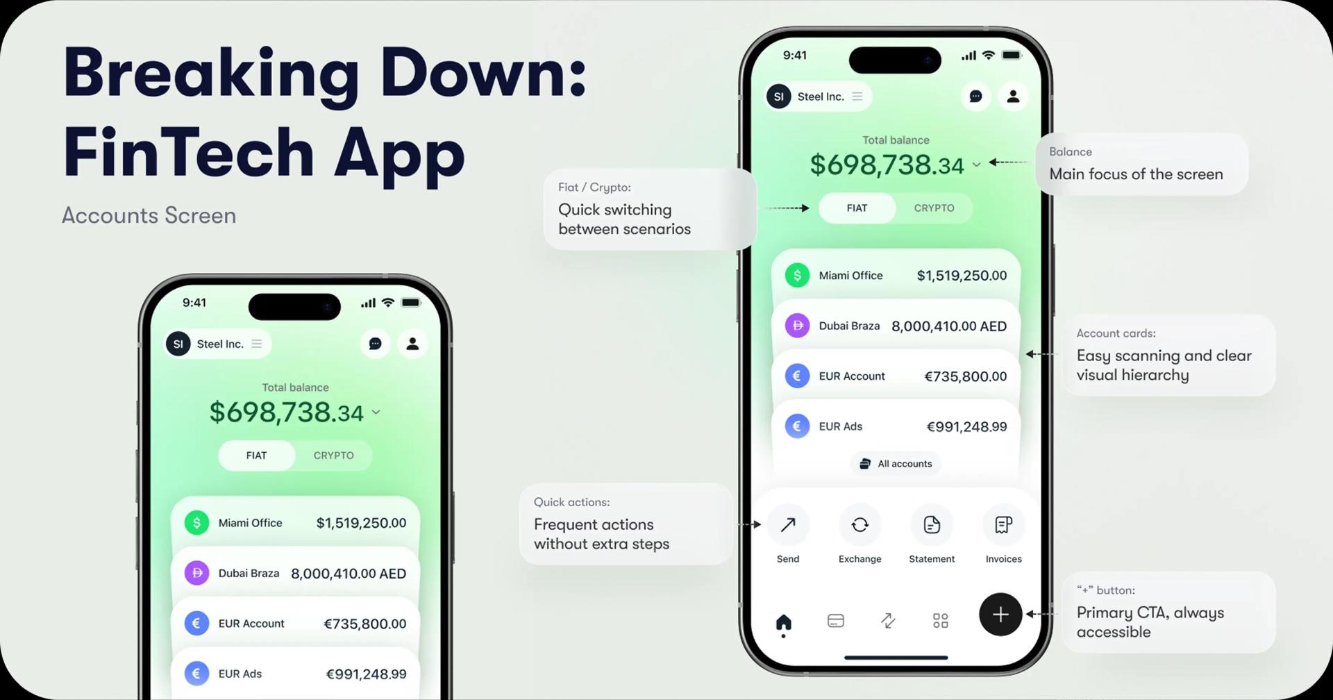 This screen is designed around a clear goal: helping users quickly understand their financial situation and access the most common actions without friction.
Balance as the primary focal point
Positioned in the center and visually emphasized, as checking the balance is the most common user intent when opening the app.
Fiat / Crypto toggle
Allows users to switch between asset types instantly, without navigating to separate sections.
Card-based account list
Stacked cards create a clear hierarchy and improve scanability compared to a flat layout.
Quick actions on the main screen
Core tasks like sending or exchanging funds are available directly, reducing navigation depth.
Action button “+”
Serves as the primary CTA and remains accessible at all times as a shortcut to key functions.
This example shows how thoughtful design decisions can turn complex financial data into a clear and usable experience. By reducing friction, prioritizing key user actions, and structuring information around user needs, the interface becomes easy to navigate in everyday use.
The Chili Labs Approach
📚 Most teams talk about learning. At Chili Labs, it’s built into the culture.
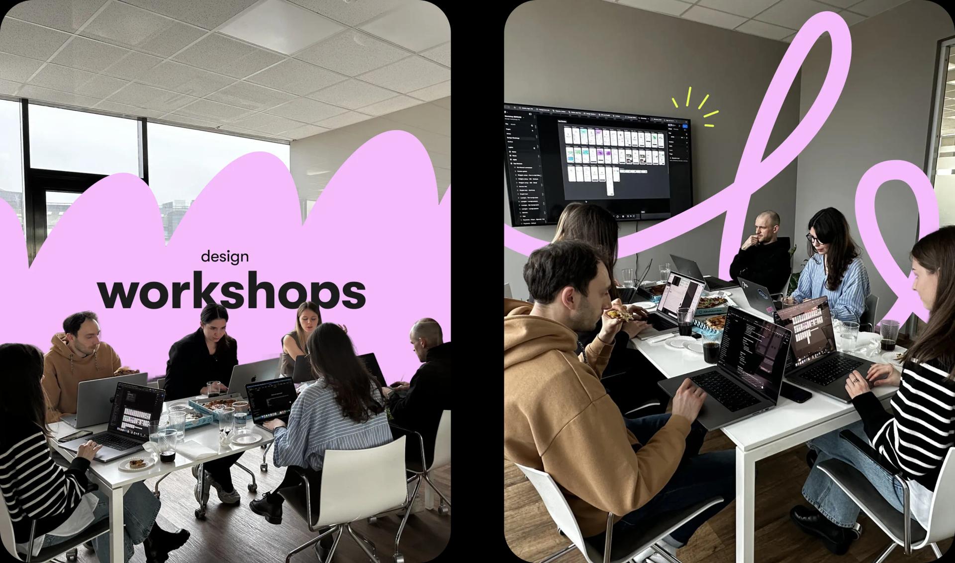 We run monthly design workshops led by our team, with each session focused on practical topics that can be applied directly in ongoing projects. It’s not about theory, but immediate use in day-to-day design work.
One of the recent workshops explored AI tools for faster workflows, smarter execution and automation. During a single session, every designer created a new app feature concept, testing how these tools can support real product thinking.
Good digital product design is never static. It changes with user expectations, technology and business needs. What matters most is how quickly it adapts and stays relevant over time.
At Chili Labs, this mindset connects design, engineering and continuous learning into one approach. The focus is on building products that perform well today and continue performing in the future.
👉 Explore how we shape product ideas into clear, scalable designs.
Similar articles
Discover more with our related articles section. Stay informed about mobile app development, event organizing, and more.

Ask the Right questions Before starting a UX/UI Design Project
Effective UX/UI design process starts with the right questions. Learn how to prepare for design project by interviewing stakeholders and...
AI buzzwords for beginners - terminology cheat sheet
Were you ever confused by the terminology in a conversation about AI? Felt lost after hearing words like “LLM,” “hallucination,”...