Balcia design & flutter mobile app

Balcia app design & development

Imagine an insurance app that’s like your safety net in the digital world. It’s your one-stop shop for all things for the insurtech, making the traditional insurance companies anything but boring!

 A hand holding a smartphone displaying the open "Balcia" app on its screen, showcasing its user interface. A hand holding a smartphone displaying the open "Balcia" app on its screen, showcasing its user interface.
 A hand holding a smartphone displaying the open "Balcia" app on its screen, showcasing its user interface. A hand holding a smartphone displaying the open "Balcia" app on its screen, showcasing its user interface.

Overview

Services we provided

Chili Labs was tasked to create research, design system, design and development of the Balcia mobile app.

Design System
Design
Development
Process of delivery

How we started

Our main task was to make a non-standard, innovative mobile application design and app development for an insurance services. Chili Labs participated on all stages of project implementation: ideation phase, research, and a design concept. We used bright colors, bold images and atypical compositions.

 A woman is positioned next to a fence A woman is positioned next to a fence
User interface of the Balcia mobile appUser interface of the Balcia mobile app
A dynamic visual with the words "Insurance Is Not Boring Anymore,"A dynamic visual with the words "Insurance Is Not Boring Anymore,"
 A woman is positioned next to a fence A woman is positioned next to a fence
Image with text font color palette Image with text font color palette

Disrupting the insurance world

Digital only insurance purchase

Whole app idea was to serve as a digital first and only source how to purchase insurances, submit claims and do all the activities that you would do with on-site. The target audience is young people who are technically advanced and are used to do everything online. They are trying to avoid human interactions as much as possible, replacing it with apps and relying on tech to help out in all the questions.

A skateboard with a phone displaying the open Balcia appA skateboard with a phone displaying the open Balcia app
 Two Balcia cards displayed, showcasing the insurance price prominently on each card. Two Balcia cards displayed, showcasing the insurance price prominently on each card.
A man stands near a blue containerA man stands near a blue container
Mobile device displaying the Balcia app with an open price policyMobile device displaying the Balcia app with an open price policy
A woman is featured in front of a clear blue sky, accompanied by the phrase "Not Boring,"A woman is featured in front of a clear blue sky, accompanied by the phrase "Not Boring,"

App Usability

Submit a claim online

The challenge that we had to resolve, was to speed up the claims submission filling in and compensation processing through the app. Mobile application helps user to pre-fill as much information as possible and the more information is input before, the faster it is to use in the future.

 A diverse group of individuals engaged in conversation A diverse group of individuals engaged in conversation
 A phone with the "Balcia" app visible, lying down on a table A phone with the "Balcia" app visible, lying down on a table
A woman holding a phone in her handA woman holding a phone in her hand
 A woman's legs are visible as she sits, accompanied by the text "Wow" A woman's legs are visible as she sits, accompanied by the text "Wow"

Customisation & inclusivity

Dark / Light theme to work for everyone

App was designed with a clear, simple layout, contrasting colors, through visual and consistent navigation and font-scaling friendly for the better accessibility. We incorporated inclusivity and availability for everyone in mind.

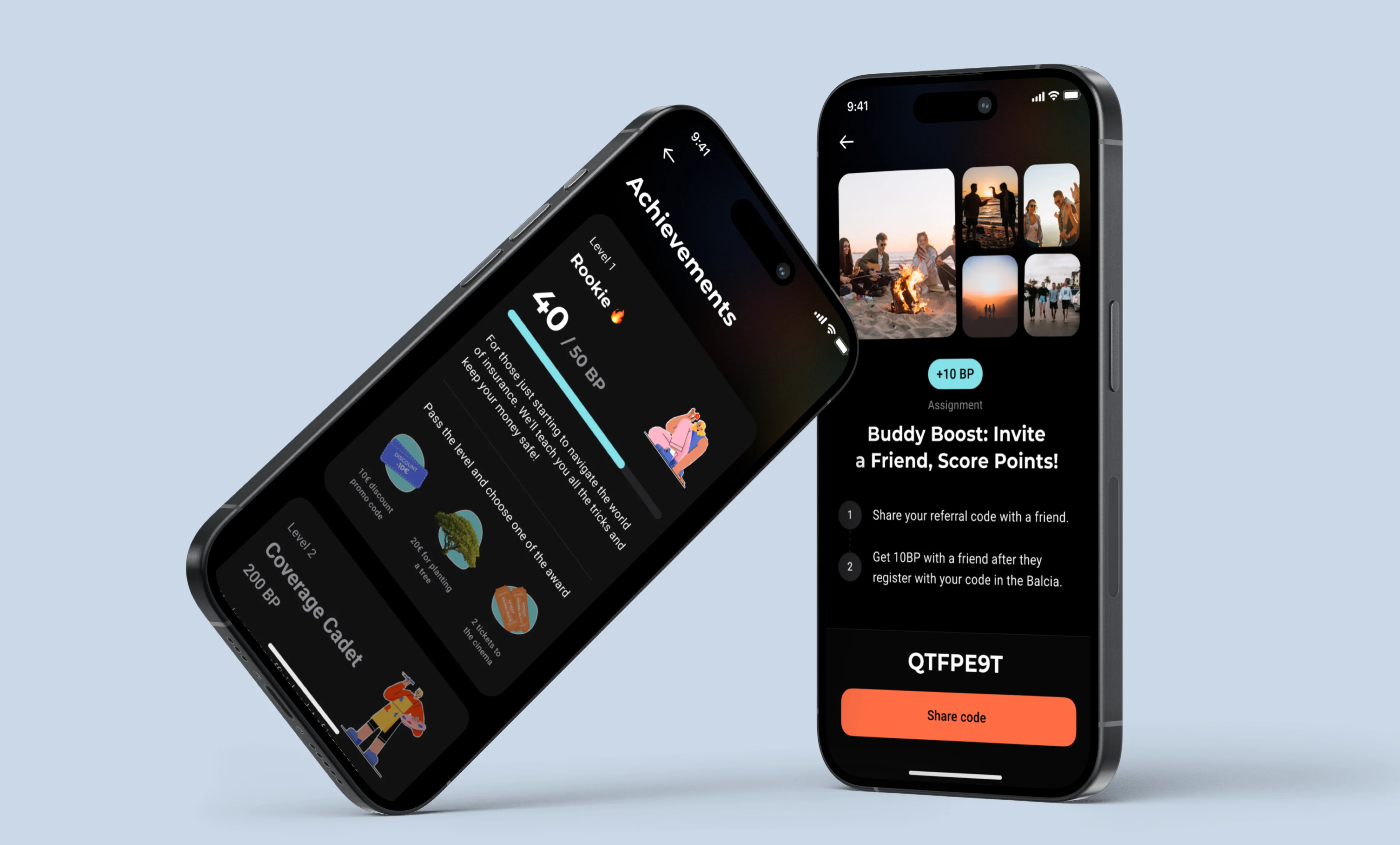
Two smartphones positioned closely, displaying a dark-themed application interface on their screens.
A collection of circles, each containing a different individual,A collection of circles, each containing a different individual,

Future support & adjustments

Design System

We created a collection of reusable components and clear standards that can be assembled together to build any number of applications. Completed design systems aid in digital product future design and development of products, it makes mobile apps and websites consistent and easier to maintain.

A woman gently leans forward to sniff a vibrant flowerA woman gently leans forward to sniff a vibrant flower
Image displaying the MTPL policy details alongside a price boxImage displaying the MTPL policy details alongside a price box
A collection of various icons and components displayed togetherA collection of various icons and components displayed together
 Mobile app "Balcia" showcasing a voucher for a discount on the first purchase

Available for everyone

Get your own impression and save time doing your insurance things with single tap.

Let’s build products together!

Contact us