The expert usability review of FoodyLife app


Feb 07, 2020
•
10 min
•
Sep 30, 2025

Written by: Aleksandra Kulagina
Hi there! 👋 I am going to tell you how to test the app’s usability cheaply. This article is about an expert usability review.
“A design review is a usability-inspection method in which (usually) one reviewer examines a design to identify usability problems.”
Aurora Harley, senior user experience specialist with NNG.
As we understand, during the expert usability review a researcher looks for usability’s difficult situations. One reviewer’s time should be paid less costly than two and more, so reducing the time is allowed too.
ChiliLabs provides a simplified version of it — Express expert usability review. During this review’s type, our researcher visually aspects one interface’s user flow for usability issues and areas for improvement. The final report looks like a presentation contains detailed findings and the suggested solutions for improving the app’s user experience.
Express expert usability review of FoodyLife app had been carried. And as this project’s researcher, I want to show this process. And here we go. 🚀
Step 1
During the first stage, the app is identified. Its target audience is defined too. I’ve discovered FoodyLife that is a food tracker, which provides a simple way to a healthy diet. Nowadays, there are a lot of food tracking apps. But these apps don’t fit users who don’t count calories or who follow intuitive eating. Also, these apps don’t fit people who suffer or suffered from eating disorders or who are working towards recovery with a treatment professional. FoodyLife is useful for everyone from the groups above. It’s so because the app helps to move to a healthy diet without a strict calculation of kilocalories.
Step 2
During the next step, the user flow for review has been found out. One user flow supports cutting down the review area for further research. The smaller area is, the more detail-orientated the researcher can be. It’s said a user flow is a series of steps a user takes to archive a goal. Our goal is to record and save one meal. And we are going to move to it.
During using food-tracker apps for seven years, I’ve understood the food trackers basis. Saving your meals for a day is the main theirs feature. After a while, your food habits can be analyzed by an app. The users will be able to use this knowledge to change their food habits in the future.
The user flow for review has been found quickly for the reason FoodyLife’s basis doesn’t differ from other food-tracker apps. 😉
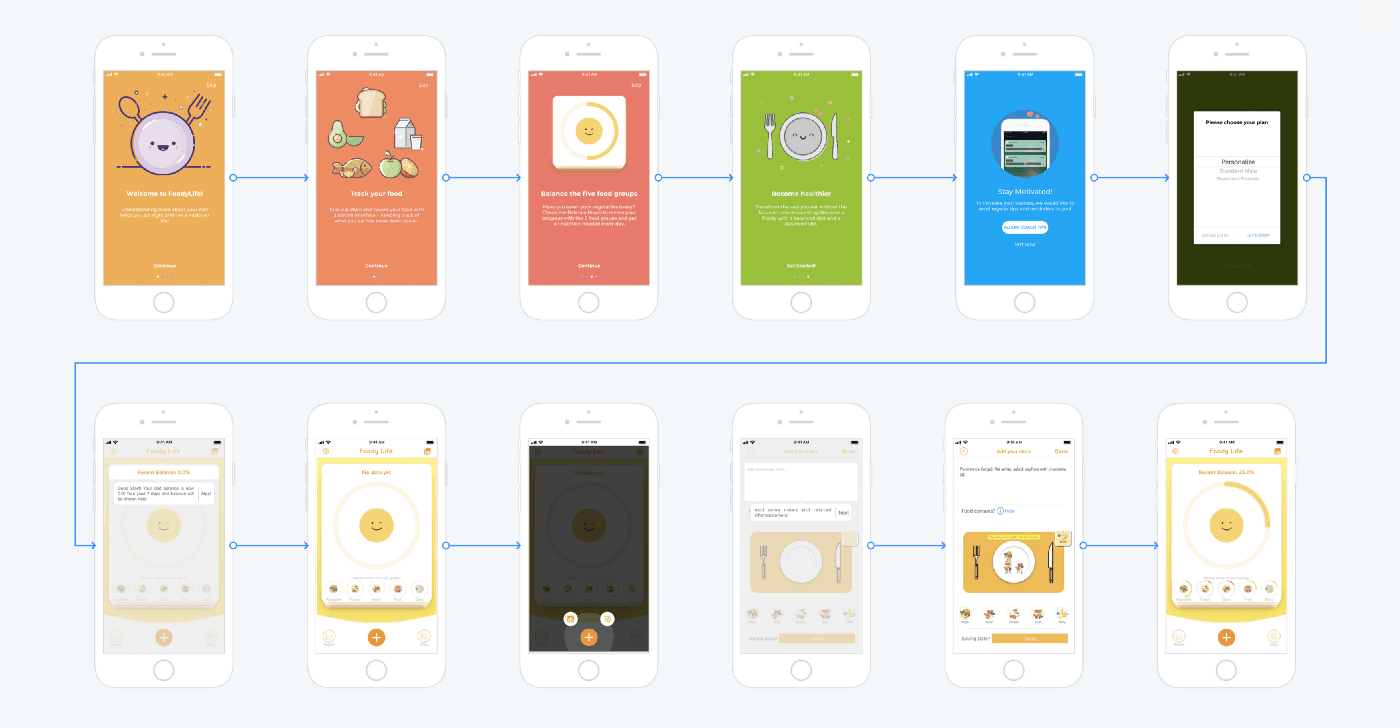
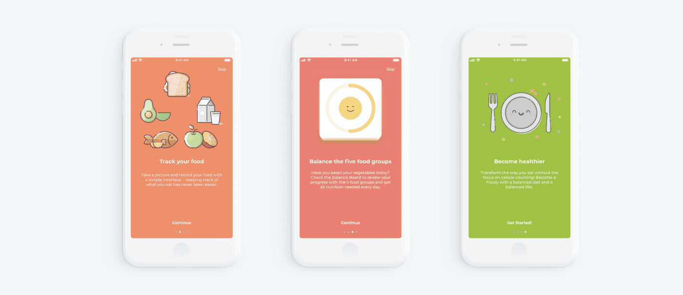
If you’ve just launched FoodyLife app and want to note your breakfast, you can move the following way. The first what you can see a friendly onboarding will be. The text under illustrations will tell you what the app is about, and these illustrations with smiles will make you smile. Although, if you are like me, you will just click on ‘next’ and won’t read the text above.
User experience has the name for this behavior. This is the paradox of the active user is a concept when the users are motivated to get started and to get their immediate task done.
After onboarding, the app asks to allow coach tips. And it isn’t the end, the app asks to choose a plan: personalize, standard male or standard female. And after it, we are introduced via text tooltips with the main functionality of the first screen.
Remind: my goal is to input and save my last meal.
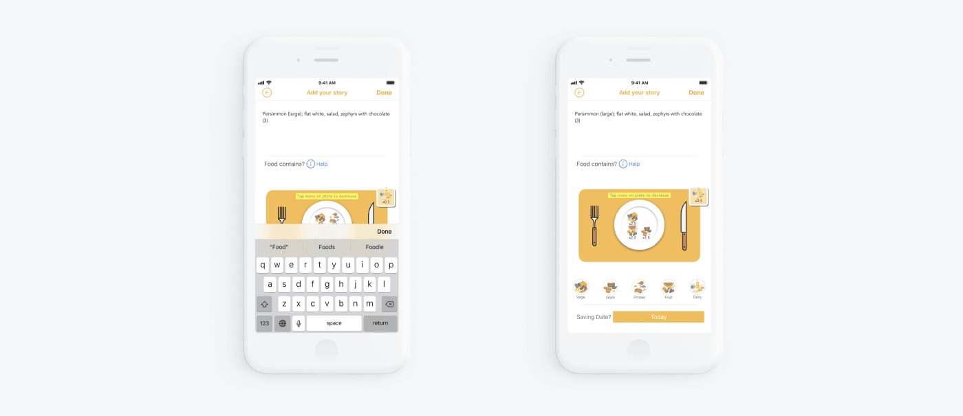
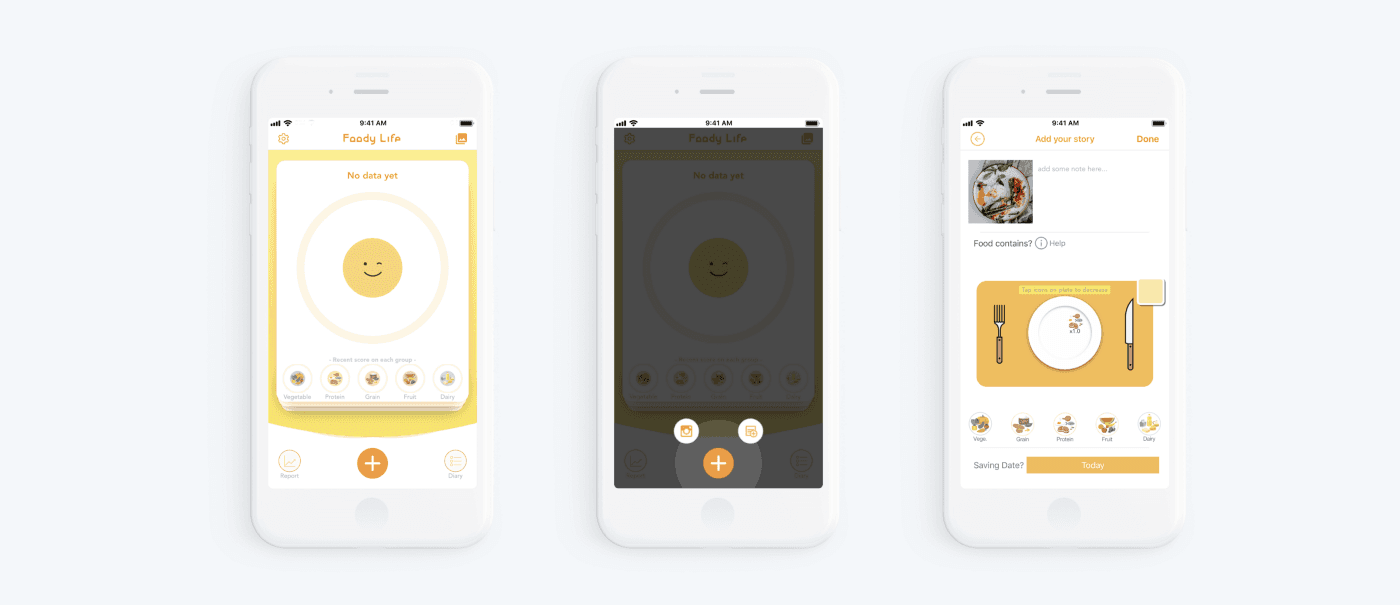
I allow my intuition to guide me via screens. Tapping on ‘plus’ is associated with a meal adding, so I tap on it. In reply to it, the app offers to select how I would add a meal with or without a photo. I select ‘without a photo’, I don’t have a photo of my breakfast.
The following step is to record a meal. Notice, FoodyLife app has a manual entry, it increases the time of lead-in. Food groups adding is the final step and this step was the most complicated for me because I spent a lot of time to choose food groups.
Step 3
OK, we defined the object of the research. Now the analysis can be started, and first, the user flow should be divided into steps. And these steps are onboarding, selecting of adding a meal and describing a meal.

Step 4
During Express Expert Review, heuristic evaluation has been used. Read more.
Jakob Nielsen, a renowned web usability consultant and partner in the Nielsen Norman Group, and Rolf Molich, another prominent usability expert, established a list of ten user interface design guidelines in the 1990s.
“Heuristic evaluation involves having a small set of evaluators examine the interface and judge its compliance with recognized usability principles.”
Jakob Nilsen, a user advocate and principal of the Nielsen Norman Group which he co-founded with Dr. Donald A. Norman.
Principle #1.
Visibility of system status. It means the user should understand what is going on at the app. For example, when we were moving via onboarding, we could see, how many steps are waiting for us next.
Principle #2.
Match between system and the real world. This principle answers the questions: Does the app speak the user’s language? Does the app follow real-world conventions?
The foody Life app talks with its users friendly and simple. Contradiction in the text is lacked too.
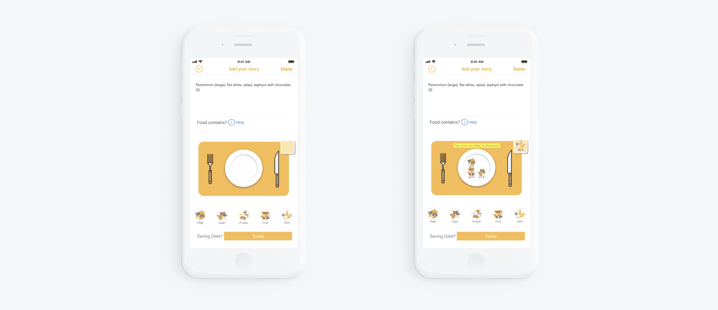
The second part of this heuristic is involved with real-world objects. To record, how many vegetables you’ve eaten for a day, the app offers to take virtual vegetables and to put them, for instance, on the virtual plate.
Principle #3.
User control and freedom. The principle means how the system helps to leave the unwanted state and to support undo and redo. FoodyLife app provides edit features, but search for each of these features can be the time needed.
When I had launched meal history’s screen for the first time, the tooltip was showed, but I missed it. And for a while, I couldn’t have found edit features.
And for a while, I’ve thought the app hasn’t edit features.
Principle #4.
Consistency and standards. The main button in the onboarding is a great example of how the graphic elements and terminology are maintained across similar platforms. The ‘continue’ button changes to ‘get started’ on the last screen. Though the name is different, the functionality isn’t changed, so and button view isn’t changed too.
Principle #5.
Error prevention. Remember, how your phone’s interface behavior looked when its power unit was critically low. The brightness has been less bright, the system has said that the power unit is critically low. This is an error prevention.
Principle #6.
Recognition rather than recall. Recognition rather than recall. Human attention is limited around five items so the interface designers should consider it.
Look at 2 questions. Is Riga the capital of Latvia? What is the capital of Latvia? The first question is simple because recognizing something is always easier than recall like we should do when we answer the second question.
Principle #7.
Flexibility and efficiency of use or how the system helps to speed up the interactions. The mobile app has a manual meal entry, though recording something is always harder and time-consuming than select from something.
Replacing manual meal entry to a choice from the list can help to improve user experience. It would be handy for users.
Principle #8.
Aesthetic and minimalist design. Communicate, not decorate — the main point of this principle. As it’s written above, our attention is limited. For that reason, the app must be made less to only the necessary elements. The elements must be provided visible and unambiguous means.
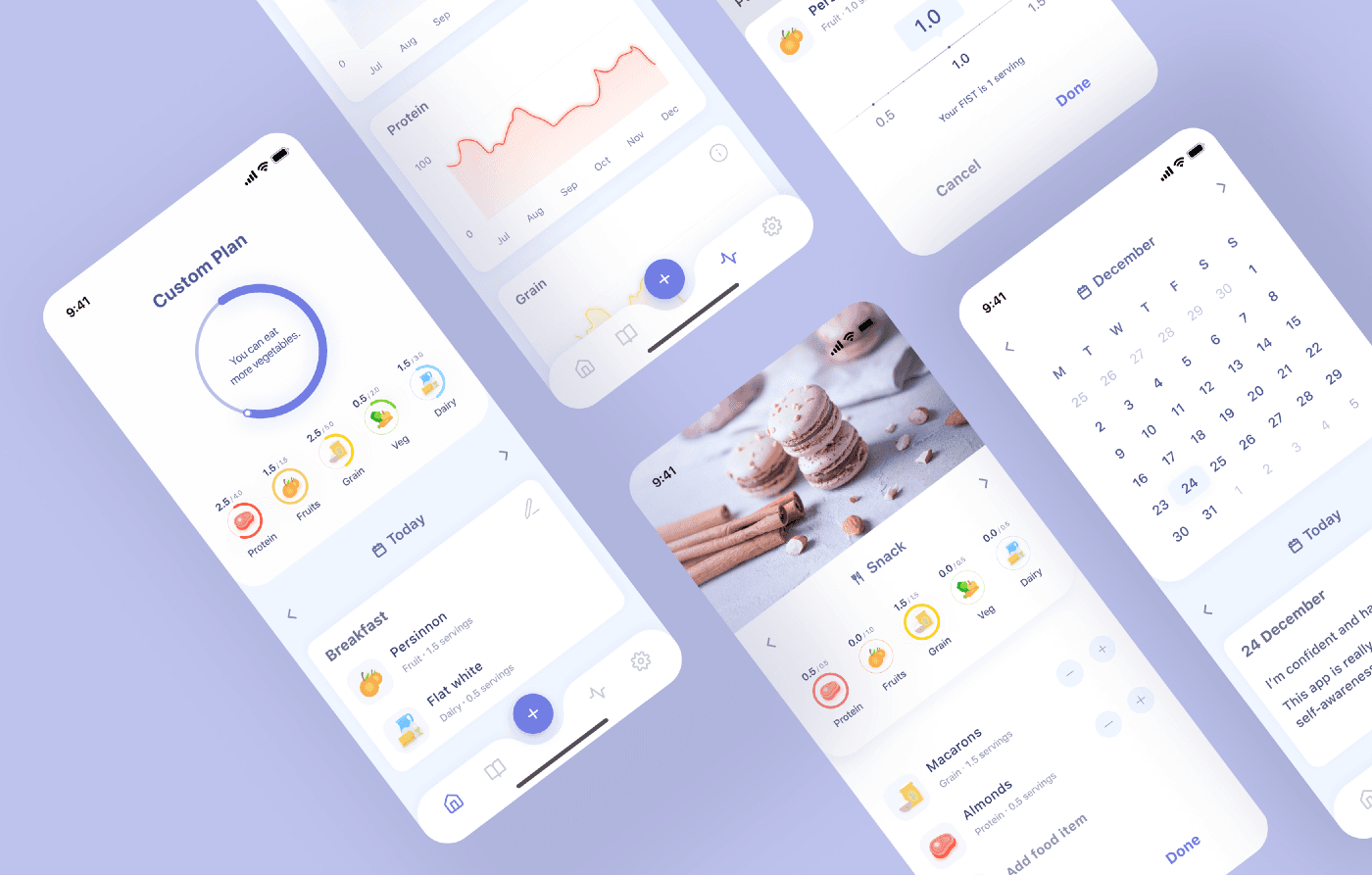
The diet balance scoreboard looks like a stack of cards, which creates the impression of the presence of other data under the main card, although they are not there.
The app has only one ambiguous element. The diet balance scoreboard looks like a stack of cards, that provides an impression of the presence of other data under the main card.
Principle #9.
Help users recognize, diagnose, and recover from errors. The interface must inform users when an error has occurred. One of the simplest ways to do it through the error message. The error’s text should tell users what went wrong and offers a solution. The solution can be something to tap right now to solve a problem. But sometimes the best way to help users recover to errors is do provide redo function.
I couldn’t find the error states in the app, but I can tell about a similar screen. The food diary’s note without photo looks like an erroneous note. This screen talks to us ‘Whoops No Image Available’. It’s true for a machine, but it isn’t true for a user. Users can think that the photo was uploaded to the app, but it isn’t available right now because of disconnection from the internet.
Principle #10.
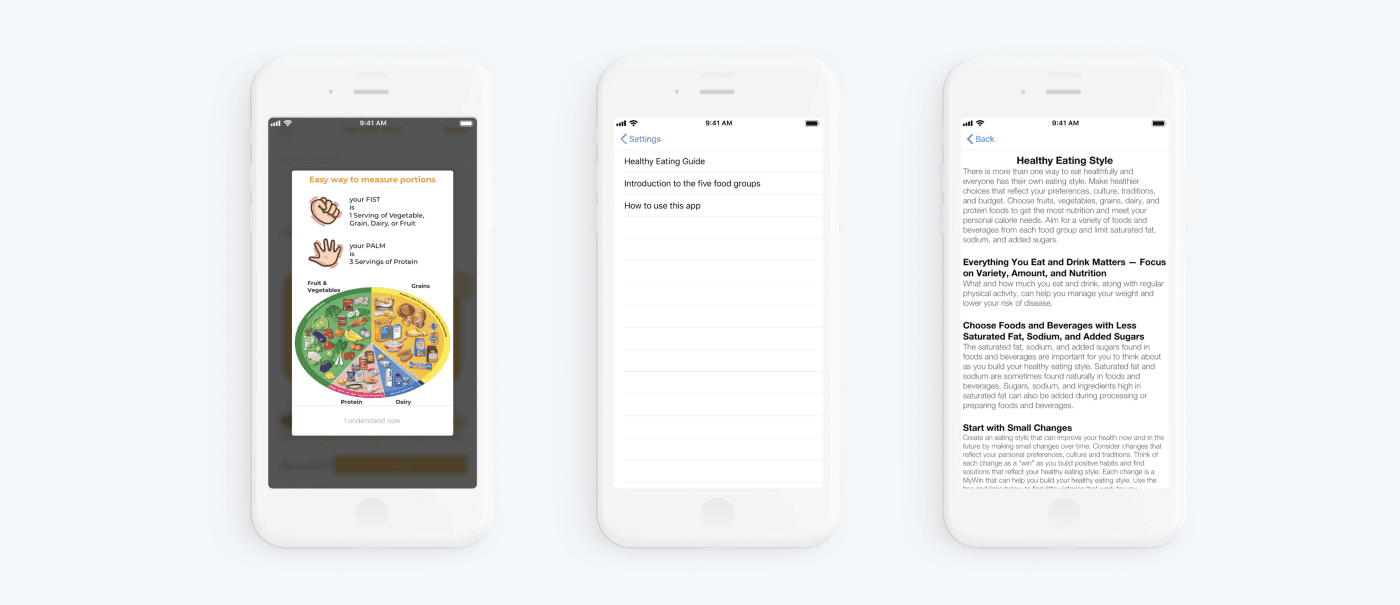
Help and documentation.
There are app onboarding pages, walkthroughs, tooltips, popovers, videos, chatbots and so on. The documentation should be easy to search and focused on user tasks. It can have a list of concrete steps to be carried out.
The app has onboarding pages, walkthroughs, tooltips, and Tips and guidelines. I haven’t written only about section tips and guidelines. This section is located in settings and consisted of 3rd articles.
Step 5.
Creating solutions for improving the app usability is the next step, so now I will present what I think FoodyLife could do to improve their app from a UX perspective after presenting the good and bad. It’ll be only about the main user flow. 😉

Onboarding pages
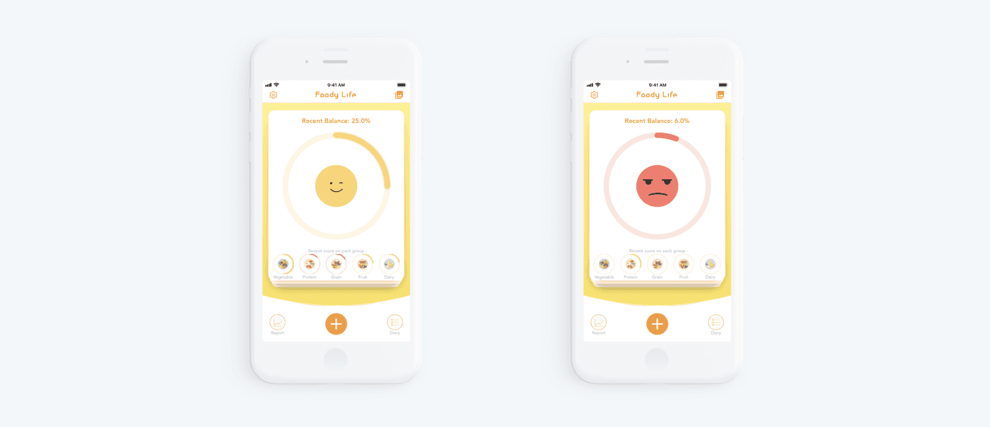
People have special neurons called mirror neurons. Mirror neurons mimic the emotions we find around us. If we see a photo when someone’s smiling or illustration has a smile, we smile too and feel a little happier.
We mirror the emotions we see. And smilingly onboarding is a really good point. Everyone who can see it will smile.
Start screen
Also, our mirror neurons are triggered with this illustration on the screen, which perfectly cheers you up if the illustration is happy with your meal balance. But the required number of servings of one or another group is difficult to consider immediately since the norm is hidden behind the illustration. Also, the scoreboard with the balance looks like a stack of cards, which creates the impression of the presence of other data under the main card, although they are not there.
Add meal
The plus button has two options — add a photo or add a note without a photo. Moreover, choosing ‘add a note’ you have no opportunity to add a photo later, but the user should always have a choice. I would recommend leaving only the plus button and add the option ‘add photos’ inside the Add your story card. This can be a tab or the add photo button.
Add your story
Add your story page has a high cognitive load. In terms of UX design, cognitive load is the strain a user experiences when he/she has to think too much just to get something done. Anything that requires users to stop and figure out what to do next is cognitive load. And when there is too much thinking, the result is a confused user who’s on the edge of abandoning the app, for example.
Cognitive load increases:
- Manual meal entry instead of a choice from the list.
- Self-determination of the group to which the dish/product belongs. For a user, it can prove a conundrum defining that appropriate category for sweet.
- Mixing UI patterns: the today button is brighter than the main Done.
Summary of the review and how we can improve the user experience of Foody App
- After adding a meal we are back to the main screen. There are a couple of interaction points that could improve UX. It’s not clear what is the date that the user is judged against, so an indication of the timeline could improve that and add context.
- Mirror neurons don’t work in positive regard if the emotions are mirrored negatively. A sad or angry emoticon is not efficient in driving continuous user behavior and product satisfaction as it evokes negative emotions. A solution has to focus on why a low score was getting. It can be inscription with advice ‘you can eat more vegetables’, for example.
To conclude, I would like to thank you for reading this article. Thanks, guys! I’ve tried to take clearly about my process of an expert usability review and I hope the article will be useful for you!

Receive related stories first. — Hit that follow button!