My journey to creating my first app
Dec 17, 2022
•
5 min
•
Sep 30, 2025

Written by: Raitis Šaripo
My journey to creating my first app
At some point in our lives we all have a problem to solve. Fortunately, I was able to solve mine by creating a mobile app. In this post I will share my experience with developing my first pet app and how skills and knowledge I learned working with Flutter helped me.
I’ll share my experience in 10 parts:
-
Decision to make a pet app
-
Identifying the problem
-
Refining idea
-
Mapping desired functionality / flow on the paper
-
Researching design
-
Inspiration
-
Creating design
-
Validation
-
-
Technical aspects
-
Developing
-
Time management
-
What does it take to create an app by yourself?
-
Next steps
Decision to make a pet app
Honestly, I didn’t really put much thought into this, I just went with it. I thought it was time to put the skills I learned at work to test and try to create something of my own. And along the way gain experience as a mobile developer, and just to add to my base of knowledge by learning new things and skills.
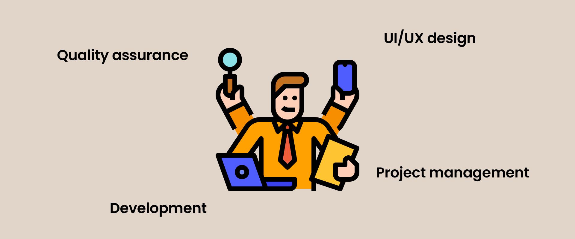
I essentially became a 4 people team that consisted of such departments like Project Manager (PM), Quality Assurance (QA), UI/UX designer and of course Development.
As a PM I had to manage my own time and work (coordinating tasks for yourself is not as easy as it might seem).
As a QA I had to assure the quality of my work - testing the app functionality and that it conforms to business requirements.
As a UI/UX designer I was responsible for creating UI that meets the user interface standards of the mobile industry.
Problem vs solution
First step in my pet app development journey was identifying the problem that I wanted to solve. The second step was refining the idea so it’s clear what I’m trying to achieve.
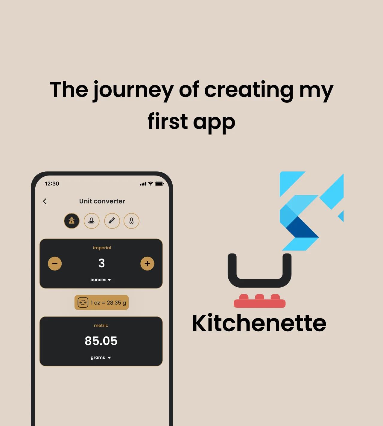
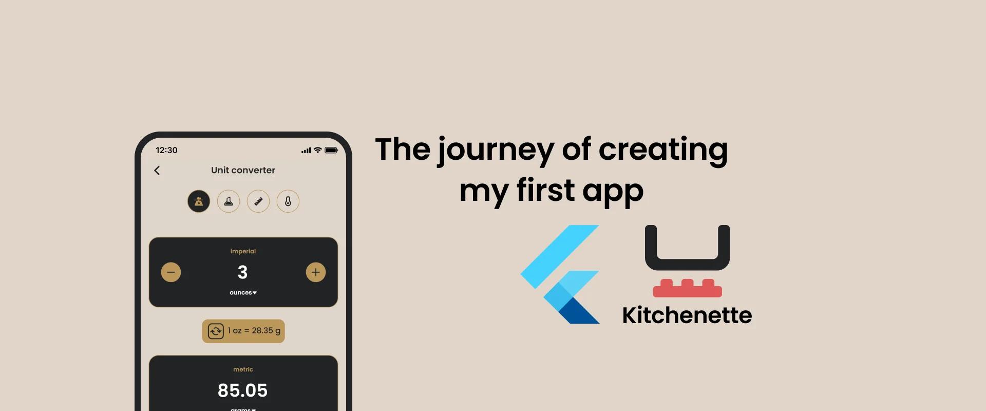
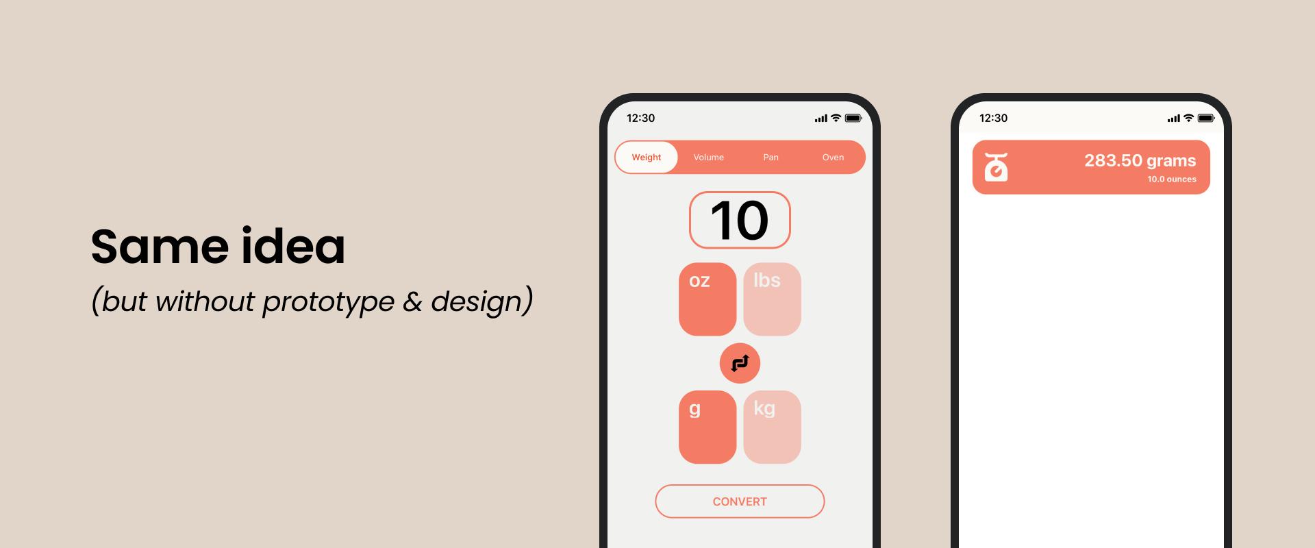
I enjoy baking from time to time so I often look for new recipes on the internet to try out. Majority of the time those recipes are written using the imperial unit system for unit measurements. That is unfortunate, because I’m used to the metric unit system and from the top of my head don’t know conversion rates between imperial and metric units. And each time I look for a recipe I also have to open a unit converter on the web and convert units, so I’d understand what amounts to mix together.
“Why would you need an app for that if you can do it using a web browser ?”, you might ask. Well, the problem starts when I convert each unit, but don’t write it down and if in future I want to make the same recipe again I have to do it all over again.
Sure, I could write it down on some piece of paper and stash it somewhere, but more often than not those things get lost or thrown out with a bunch of other papers.
Another option would be to write it down in a notepad, but what if I want to share it with my friends or family, print it out etc? Just taking a picture wouldn’t really cut it.
Refining idea
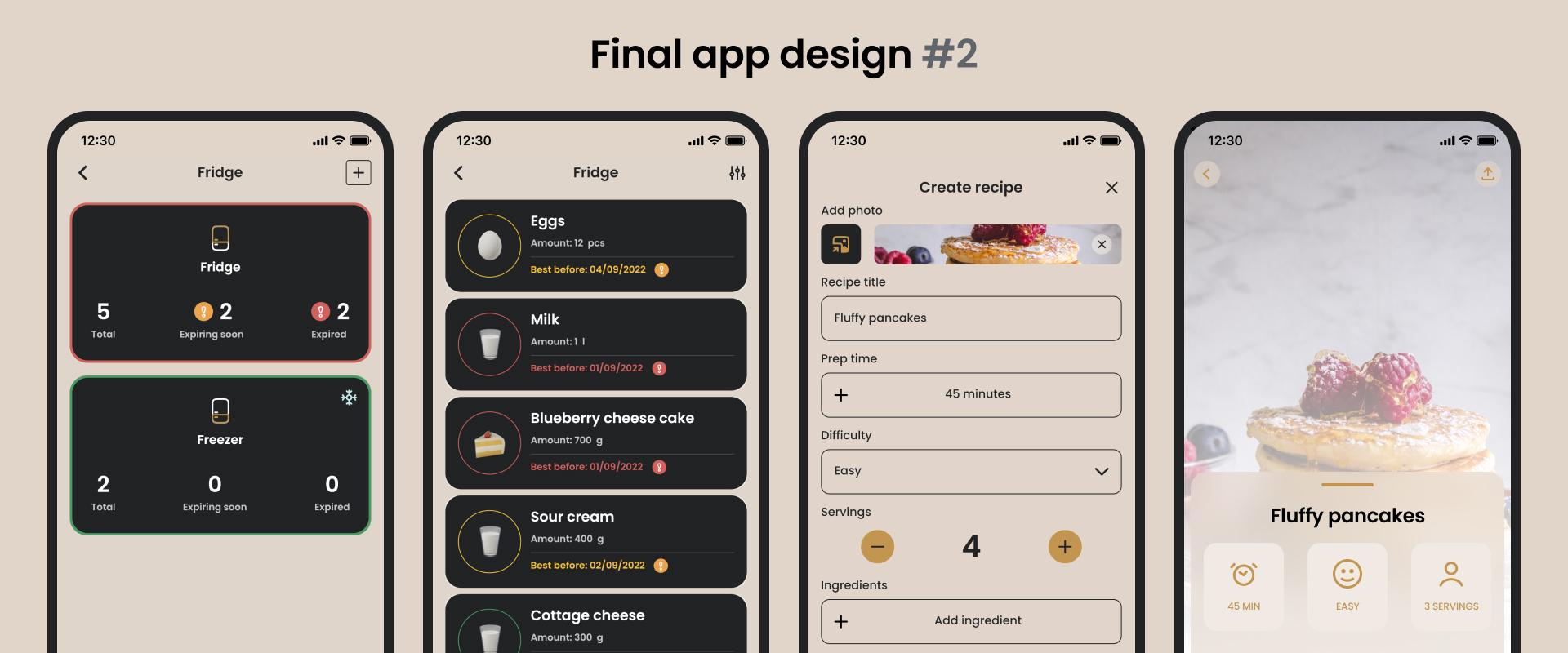
So I decided to create an app which does exactly that - converts units and stores them. But why stop there? I talked about wanting to save and share recipes. I added functionality that allows users to create, save recipes and share them. Now the app offers converting units and saving and sharing recipes. But it’s still not enough. I also want to make it universal enough for people who are not interested in unit conversion or recipes. And that’s the reason why I added functionality that allows users to track their products in the fridge.
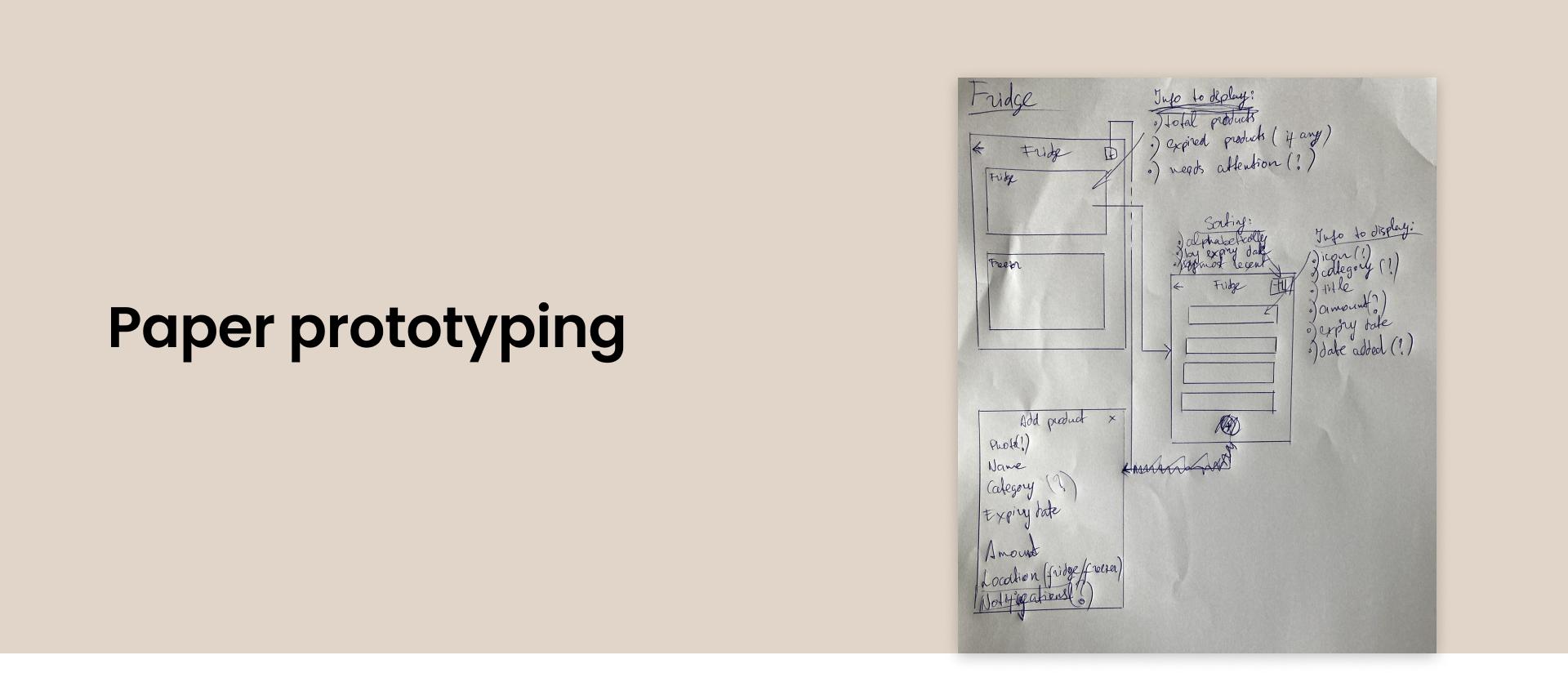
Mapping it on the paper
To better understand what I’m trying to achieve and how the desired app flow should look like, I drew it on a blank sheet of A4 paper (also known as paper prototyping). Since I will be designing the app interface myself, this will also help me understand how and where different UI elements should be located on the screen.
To start it off I drew a huge rectangle that represents the screen of the device. Next to it I wrote down what elements it should consist of (e.g. unit input fields ‘from’ & ‘to’, save button etc.) and what is the basic functionality of each element, just to understand the general functionality of the screen. Next I drew smaller rectangles inside the screen to approximately position UI elements. Next step was drawing an arrow that represented routing between screens. In some cases there were multiple such arrows, because depending on actions within the specific screen user can be redirected to a different screen each time.
Once this was done and the app flow and logic was understandable and clear, it was time to move on to designing the user interface.
So now I’ve defined the problem and refined it and come up with the initial solution, at least on paper, it’s time to move on to converting my drawings to an actual design.
Designing user interface
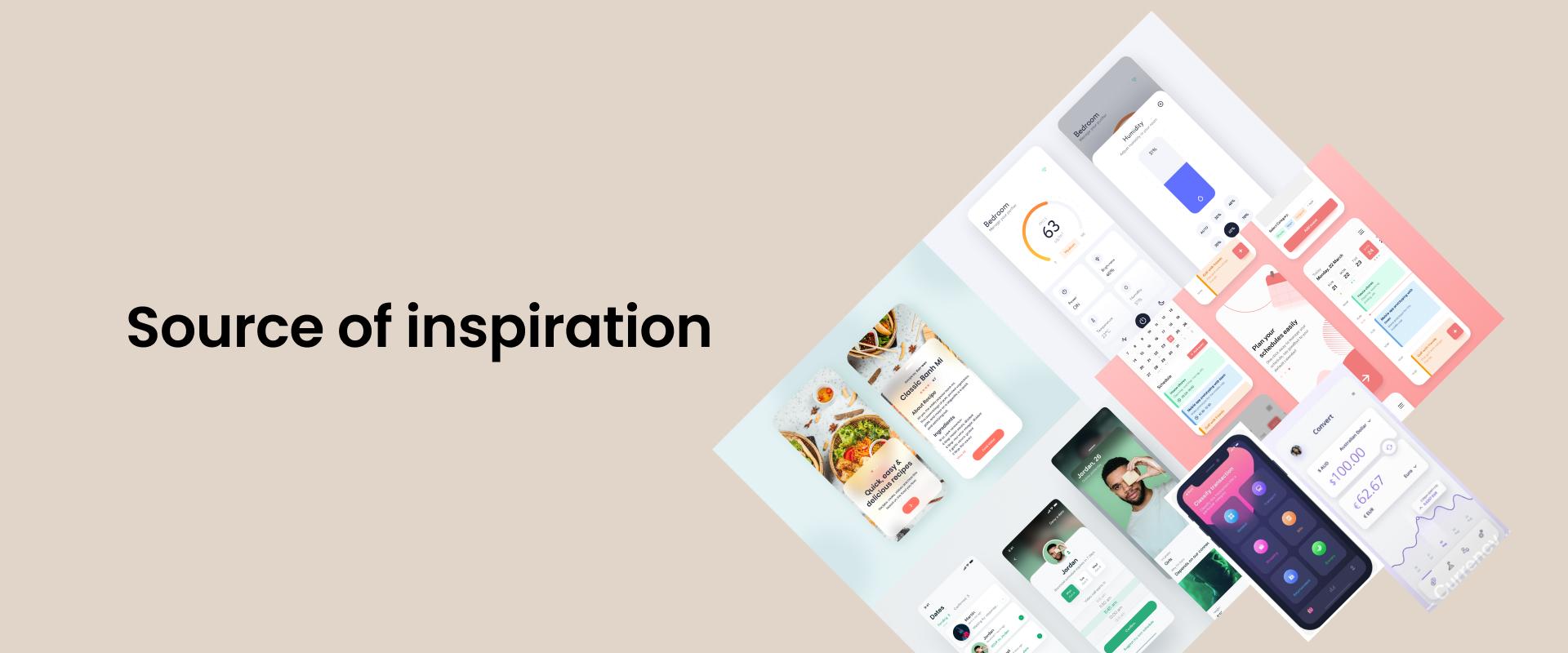
My creative days are long gone so I dived right into the abyss of available mobile (and web) designs online to get inspired by the work of others to create something of my own.
I divided app design part in 4 smaller parts:
-
Research
-
Color scheme
-
Creating design
-
Validation
Research
My approach was looking for bits and pieces from other designs that caught my eye and I’d like to see in my app. This process consisted of multiple layers of self validation.
-
First I added every design that I liked to my designs folder.
-
Then I went through all of them to see what could be combined together, what would look good, what is necessary etc.
-
Finally I modified the UI elements that I liked the most and tried to add my own style to them.
Color scheme
Creating light and dark UI requires more knowledge about color schemes and takes up more time creating the complete design. Although there are tools that can automate this process, I chose the best of both worlds - a color palette that is not too bright nor too dark. A median between light and dark UI themes. Something that’s easy on the user's eyes and don’t necessarily cause the battery to drain quicker.
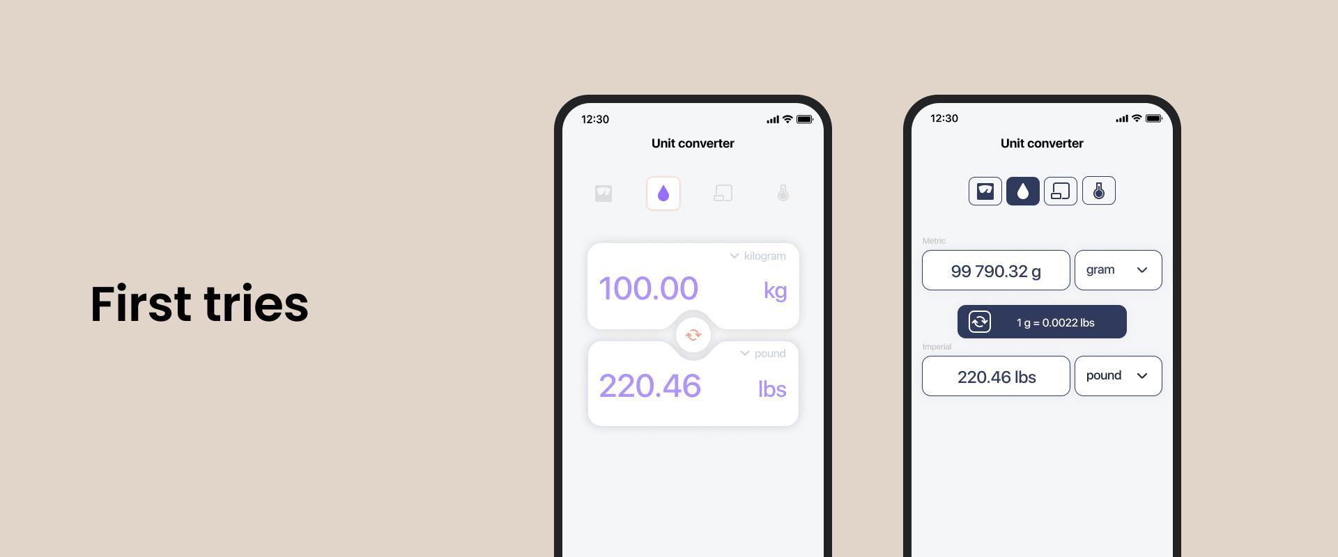
Creating design
For the creation of actual design I chose interface design tool Figma. I’ve been working with it daily at Chili Labs trying to implement great designs made by our design team into the app. It was fun. It reminded me of Photoshop in some ways so I was able to pick up the basic skills needed to create a complete mobile design pretty quickly.
Validation
Just like in a professional environment the design first needs to be approved by the client. In this case that’s me. I actually validated every screen right after it was made and after each flow was done (e.g. recipe flow). Of course in case a new idea came to my mind and changes had to be made to existing design elements I re-validated it afterwards. But the validation process wasn’t always smooth. There were times where I had to redo the design for a specific screen or flow multiple times to ensure the best UX possible. In my opinion the end product came out great. It was definitely worth the effort.
Technical side
I used Flutter (Google’s open source UI kit) for development. I chose Flutter because I’ve had some experience with it already and I really wanted to create an app both for iOS and Android users. And Flutter let me do just that - create an app for multiple platforms from a single codebase.
For my first app it was really important to not only understand the iOS side of the app development process (iOS developer here), but also Android. Flutter helped me with that. But why did I want an app for both iOS and Android platforms? Well, first of all it means that the app can potentially reach more people (bigger audience). Bigger audience means more downloads (fingers crossed) and more recognition. And let’s not forget the financial side of this - having a monetised app on both platforms improves your chances of getting something back for the work that was put in.
Also developing 2 apps with a single codebase using Flutter meant that I could get to learn how markets work for both platforms.
Once I decided which technology to use to develop my first app I could start considering other technical aspects of the app.
For an MVP (Minimum Viable Product) product I wanted to make the flow and user experience as simple as possible, without authorization and additional setup, so that users can use it right out of the box. One drawback to this is that I won’t be able to implement back-end and all the conversions, recipes and products would be saved locally.
Since I wanted to learn new things I decided to explore existing libraries and choose some that I haven’t used before, e.g. Isar - cross-platform database for Flutter. Since I started using it, Isar has really grown in popularity and functionality, and it also has its own database inspector which in itself is really cool and makes the development process much easier.
Development
Development itself was really fun. I was excited to work on my own app for the very first time and nothing could bring that excitement down throughout the entire app development process. My previous experience with Flutter and working with a project really helped me to create a good structure for my app - separating data and domain layers, abstraction etc.
Time management
It’s hard to tell how much time (development hours) I exactly spent working on the app.
I started in late December with designing UI and published the app in mid August. Designing the initial UI (during the development stage the design was updated when necessary) took me about 1 month.
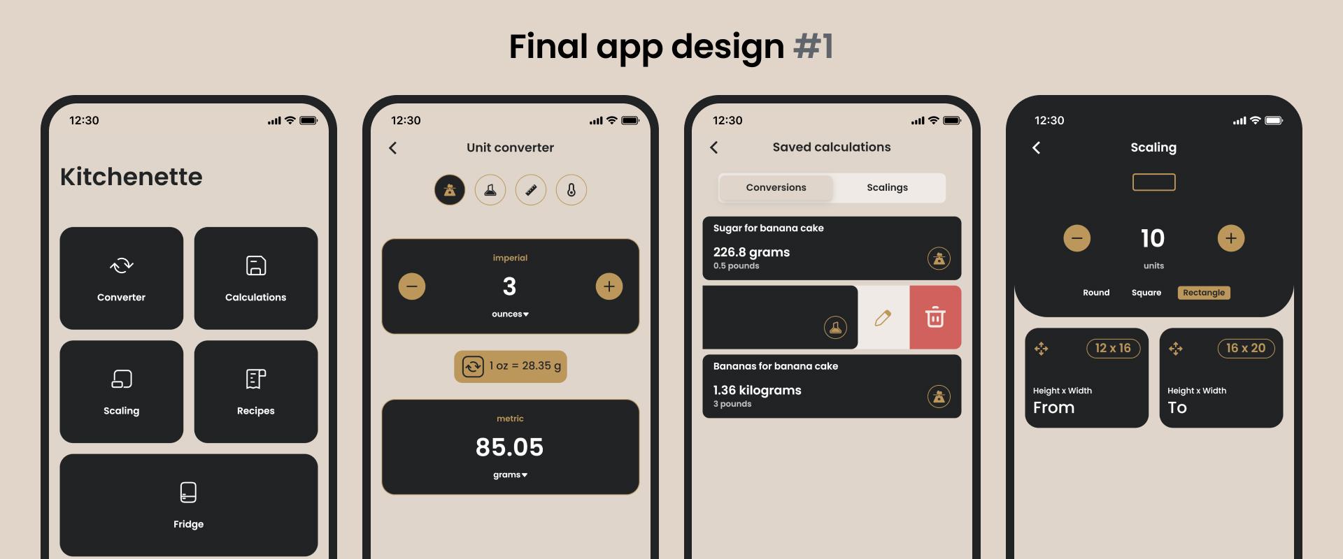
The initial UI consisted of:
-
Home screen
-
Converter screens
-
Calculations (conversions, scalings) screen
-
Scaling screens
-
Recipe screens
I was mostly working on weekday evenings for about 1-3 hours, depending on the scheduled tasks and energy reserves after an 8-hour work day.
To avoid burnout I did some physical activities (running etc.) before working on my pet app. Because if you’re more tired physically, there is a higher chance that you won’t stay up too late and will get enough sleep to recover mentally and physically for the next day. I didn’t work on Saturdays at all. I used those days to recharge and reflect on the work that was done during the week.
Overall it took me approximately 9 months to develop the app - from paper prototype to published product in store.
What does it take to create your own app?
Besides all the hardware and software necessary for software development, you need only one characteristic that will help you get through the journey of app development. It's called stick-to-itiveness.
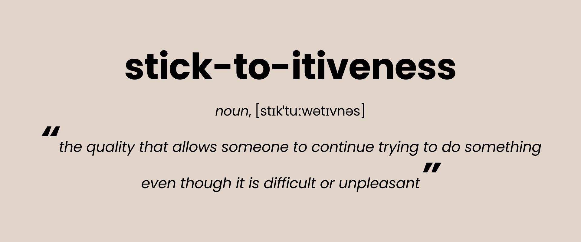
In simple words, you have to be disciplined enough to keep your course and your eyes on the prize - motivation is what gets you started, but discipline is what keeps you going. So, just by sticking to it I was able to successfully conclude the journey of my first pet app development and become a product owner of my first mobile app.
Next steps
First things first, I am definitely taking a well deserved break, because a lot of time and effort was put into trying to make my first app as good as possible.
Obvious next step is to promote the app. It’s really up to you - tell your friends and colleagues about it, share it on social networks, advertisements or promote on forums that are read by the target audience of the app.
Can’t lie, app development is kinda addicting. I am already thinking about creating my next app, but this time a native app for the iOS platform using SwiftUI framework. Stay tuned!
Check out the Kitchenette app on App Store or Google Play Store
— Raitis