Implementing design system components on iOS
May 19, 2020
•
5 min
•
Sep 30, 2025

Written by: Igor Nemenonok
As a native iOS developer, I’ve been jealous of web developers who can use design systems in their everyday workflow. The ability to look through the library and copy the code of a component can increase the development speed.
Let’s compare how the radio button is described for web and mobile on the Shopify’s design system called Polaris. As we can see, the code snippet is provided for the web, unlike iOS or Android, where you can find just images of the representation.
Usually, iOS developers implement typography, colors, imagery, simple components like buttons and switches, and that’s it. UIKit is not as friendly for design systems as Web or even SwiftUI, where you can construct user interfaces in a nice declarative way. As we still need to support a few previous versions of iOS where SwiftUI is not available, we can develop an approach that can help us to construct user interfaces much quicker and in a more declarative manner.
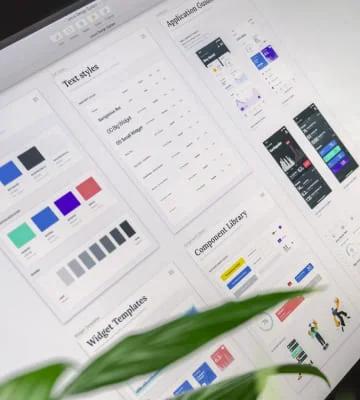
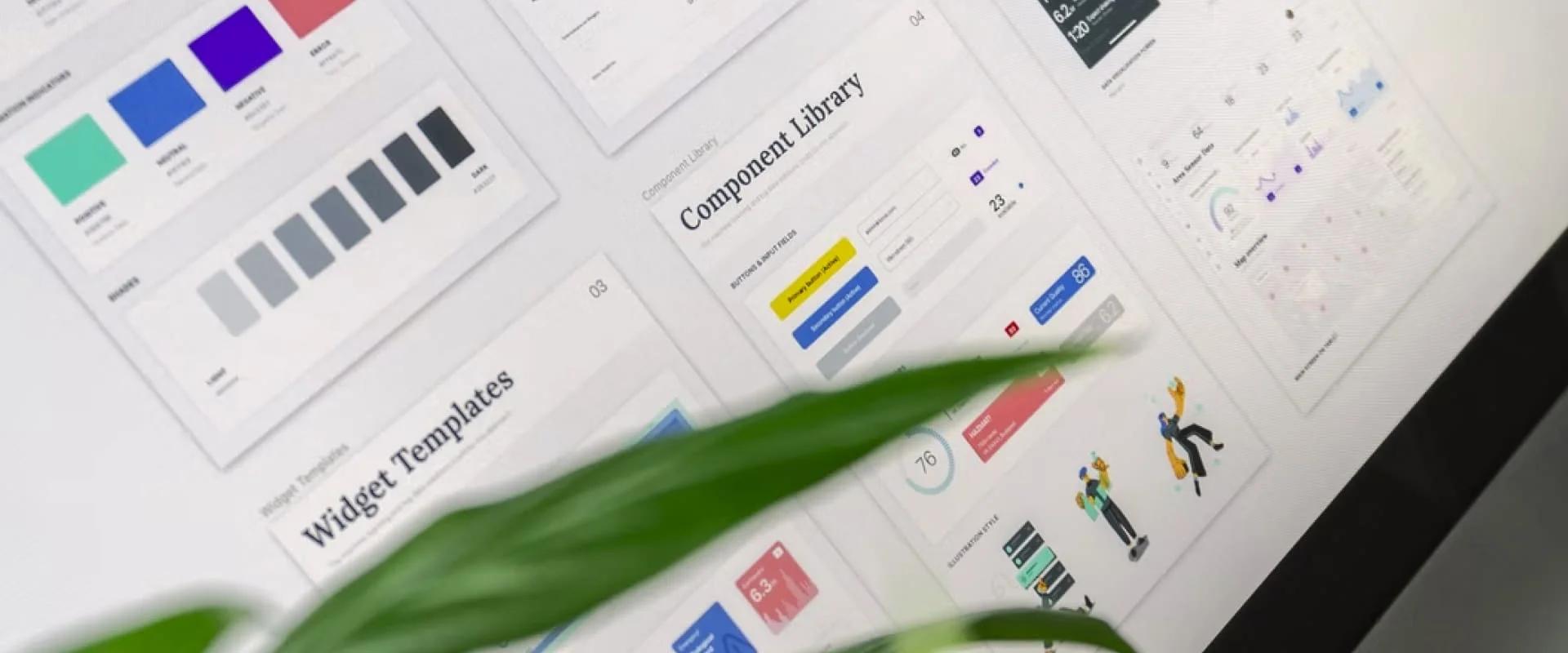
What is a design system, and how it can increase the development speed?
A design system is a collection of reusable components, guided by clear standards, that can be assembled together to build any number of applications.
Benefits of having a design system components in your app:
- You need to write components once and reuse them all over the app. It’s like a big box of UI Lego pieces that can be assembled in near-infinite ways.
- Junior developers can be responsible for making these components separately from the business logic.
- Components can be reused in different apps.
- Collaboration and knowledge sharing increase.
- Clean and clear codebase.
- The ability to copy/paste code from a library page.
The approach
I think it is not worth mentioning how to wrap Fonts, Typography, or Imagery into the design system on iOS as there are plenty of examples on the internet that can be easily found. Let’s focus on making “Lego bricks” of our user interface. As an example, I will take an interface from a dribble shot that was made by my teammate Andrey Lohmatov, and split it into components.
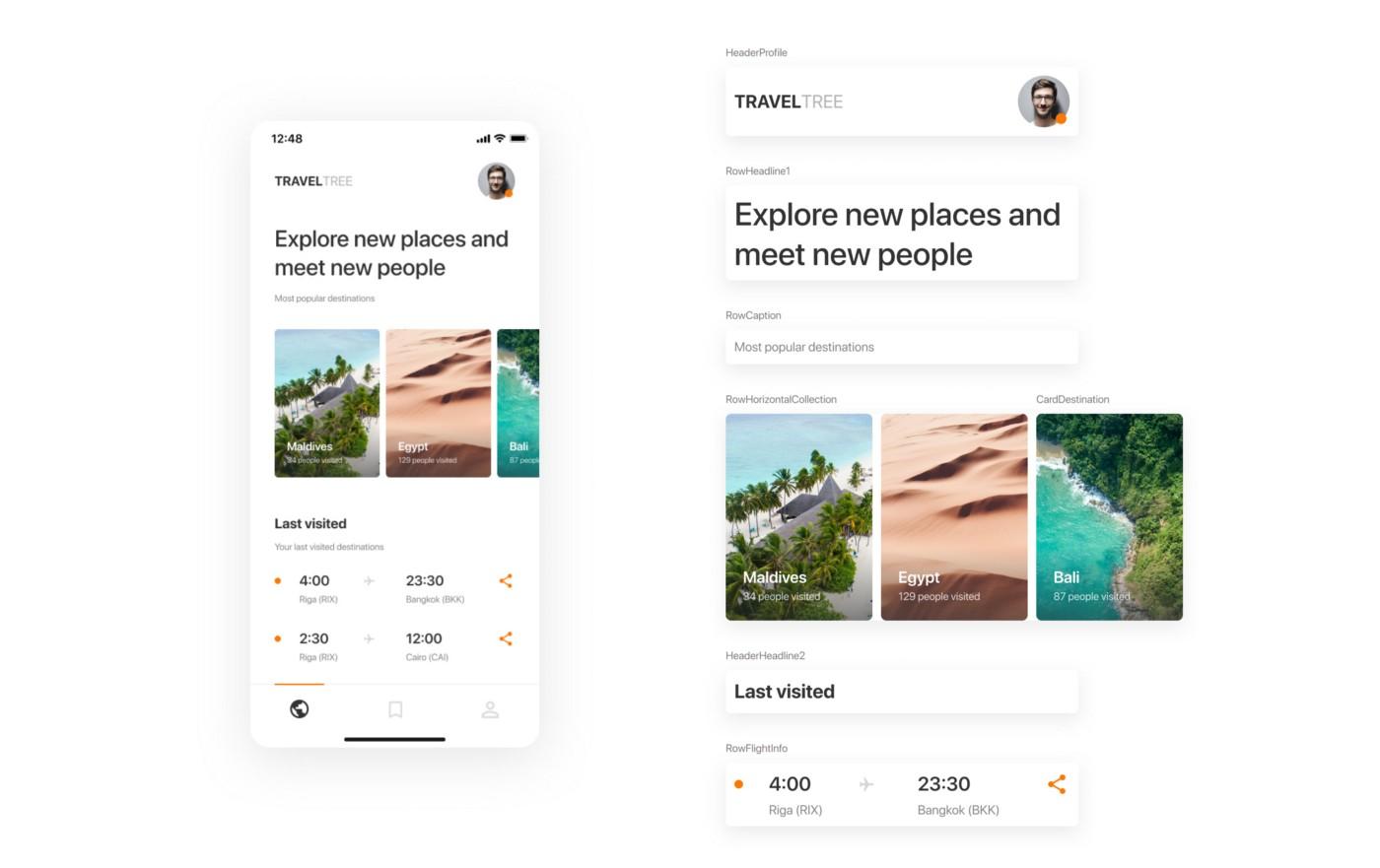
Airbnb’s MagazineLayout library fits well for our purpose. I like the idea that any screen can be represented as a set of cards and rows on a collection view. The library has handy declarations of item widths based on a fraction of the total available width (full width, 1/2, 1/3, etc.).
To keep the project well organised we can introduce a naming convention for our components.
Row — full-width cell (RowText, RowFlightInfo).
Card — a cell with a fractioned width (CardDestination, CardPhoto).
Header — supplementary header view (HeaderHeadline1, HeaderHeadline2WithSubtitle).
Footer — supplementary footer view (FooterTotalText).
You can add more types, I just giving you the idea.
Now, we can wrap cell manipulation with configurators approach from one of my previous articles. Configurators will help us to write the UI in a more declarative way. Basically, you will construct the user interface in a view controller’s view model.
In my implementation, I will use the following stack: MagazineLayout, RxSwift, RxFlow. If you’re not familiar with RxSwift, I highly recommend trying it, as reactive programming is a must nowadays (Combine as an example). You can check the demo project on Github straight away if you don’t want to go through the steps of the implementation.
Time to code
I will not stop on each aspect of the implementation, as the complete code is available on Github. Let’s got through the main ideas.
Each cell and supplementary view should have a view model.
struct RowTextVM: MagazineCellDataType {

    var sizeMode: MagazineLayoutItemSizeMode {
        return MagazineLayoutItemSizeMode(widthMode: .fullWidth(respectsHorizontalInsets: true),
                                          heightMode: .dynamic)
    }

    let text: String

    init(text: String) {
        self.text = text
    }

    var diffHash: Int {
        return text.hashValue
    }

    func configurator() -> CellConfigurator {
        return RowTextConfigurator(item: self)
    }

    func didSelect() {
        //
    }
}
Cell’s view model should conform to a set of protocols that are responsible for sizing, selection, and configuration.
typealias MagazineCellDataType = Diffable & CellSizable & SelectableData & CellConfigurableCell’s configurator can be defined in the cell’s class and follow the same naming convention.
typealias RowTextConfigurator = MagazineCellConfigurator<RowTextVM, RowText>
final class RowText: MagazineLayoutCollectionViewCell, ConfigurableCell {

    private let textLabel: UILabel = {
        let label = UILabel(frame: .zero)
        label.bonMotStyle = Typography.Text
        label.numberOfLines = 0
        label.textColor = .captionText
        return label
    }()

    override init(frame: CGRect) {
        super.init(frame: frame)

        self.contentView.addSubview(textLabel)
        textLabel.snp.makeConstraints {
            $0.leading.trailing.equalToSuperview()
            $0.top.bottom.equalToSuperview()
        }
    }

    required init?(coder: NSCoder) {
        fatalError("init(coder:) has not been implemented")
    }

    func configure(item: RowTextVM) {
        textLabel.styledText = item.text
    }
}
Each screen can be split into sections. A section may contain header, footer, items, background, and insets.
struct MagazineLayoutSection {
    let header: HeaderInfo
    let footer: FooterInfo
    let items: [CellConfigurator]
    let background: BackgroundInfo
    let sectionInset: UIEdgeInsets
    let itemsInset: UIEdgeInsets
}
Now we can make a base view controller where we initialise a collection view and handle all MagazineLayout’s delegate and data source methods. This class should have a binder for sections where you will bind sections from a view controller’s view model. The base view controller can be inherited and used for most of the screens of your app.
To be more flexible with the UI, we can implement automatic registration of cells in UICollectionView. You can check the implementation of the CollectionViewCellsRegistrator in the demo project. Cells are registered on sections change and can be registered with/without nibs.
Finally, the screen layout can look like this:
[
            MagazineLayoutSection(items: [
                RowDestinationTitleVM(title: "Indonesia, Bali").configurator()
            ], sectionInset: UIEdgeInsets(top: 0, left: 32, bottom: 16, right: 16)),

            MagazineLayoutSection(items: [
                RowTextVM(text: "Some Text").configurator()
            ], header: .init(item: header1.configurator(),
                             visibilityMode: .visible(heightMode: header1.heightMode, pinToVisibleBounds: false)),
               sectionInset: UIEdgeInsets(top: 0, left: 32, bottom: 16, right: 16)),

            MagazineLayoutSection(items: [
                RowHorizontalCardsCollectionVM(items: [
                    CardPhotoThumbnailVM(url: "https://***"),
                    CardPhotoThumbnailVM(url: "https://***"),
                    CardPhotoThumbnailVM(url: "https://***"),
                    CardPhotoThumbnailVM(url: "https://***")
                    ],
                                               itemWidth: 164,
                                               itemHeight: 120,
                                               itemsSpacing: 8).configurator()
            ], header: .init(item: header2.configurator(),
                             visibilityMode: .visible(heightMode: header1.heightMode, pinToVisibleBounds: false)),
               sectionInset: UIEdgeInsets(top: 16, left: 32, bottom: 32, right: 16),
               itemsInset: UIEdgeInsets(top: 8, left: -32, bottom: 0, right: -16))
]
You just manipulating with sections and cells' view models.
Parallax headers
Parallax headers can be easily added to any screen as each screen is based on UICollectionView. MXParallaxHeader works for us on many projects.
Navigation
In Chili Labs, we are using RxFlow for navigation in all our apps. It is a navigation framework for iOS applications, based on a Reactive Flow Coordinator pattern.
A cell’s view model can be a Stepper and emit steps to a VC’s view model, which will forward these steps to a flow handler. Steps can be emitted on a cell selection or a button tap inside the cell. That makes the navigation handling simpler and reusable.
Server-driven UI
After some manipulations, this approach can be easily connected with a backend to make a server-driven UI. The backend can return a structure of the layout that should be rendered on the screen.
Demo project
I made a proof-of-concept project on Github to show the power of the technique described in this article.
I hope this approach will increase the quality of your apps as well as delivery speed.
Thanks for reading!

Receive a new Mobile development related stories first. — Hit that follow button
Twitter: @ChiliLabs