Developers making UI decisions, what can go wrong?


May 06, 2019
•
4 min
•
Sep 30, 2025

Written by: Maria Kovalevich
Every day every developer has to make design decisions 👨🎨
Quite often developers have to make design decisions, even if you have a finished UI design in Figma, InVision etc. And yes, you can have a UI kit and UI guidelines, but sometimes it is not enough. Especially when you don’t have a detailed design system (a common thing in custom development). And when you need to adapt a design to small devices, or you need to design some empty states, or client wants to make changes right here and right now — for these cases you need to know some stuff will help you organize UI elements wisely.
The rules that are most often broken
Among other things, I identified 3 main areas where developers need design help. Today I will tell you about the first one.
Rule #1 Proximity: related elements are placed together
So, what does it mean? Here’s a good illustration. In the picture below we can see three different personas and no story.

Well now something has changed. And we can definitely say that this lady is with the guy who stands on the right.

And now we finally have a story 😁

This dramatic case tells that elements that are placed closer together are perceived as being more related than those placed further apart.
Most often we break that rule when we group text blocks.
In the example below the header’s margins are equal.
Of course user can understand by himself what paragraph the header belongs to, but it will be much better if we let the user enjoy reading, and don’t make him feel frustrated.
That’s much better. Don’t you agree?
Element’s inside and outside space
**Space inside must be less than outside. **For example, inside space for our header is space between it’s lines. To visually separate the header from the text block the header’s inside space must be bigger than outside one.

Interface examples
Next I’ve choosen a couple of examples how the proximity rule is applied in mobile interfaces, sometimes correctly and sometimes, well not so much.
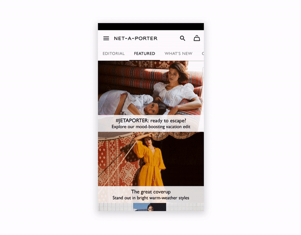
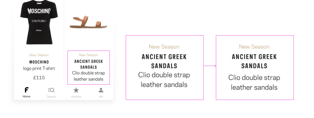
This is one of the most popular luxury shopping site Net-a-Porter. We can’t understand at first glance what item a caption belongs to.

The human brain has a limited amount of processing power and this case might make user close the app as soon as possible.
And the same thing in Net-a-Porter mobile app. You can not identify what image the caption belongs to. There is too much cognitive overload…
And what about their direct competitor — Farfetch ?
That’s a different story. There is a lot of white space, margins created by proximity rule. Almost… What do you think is wrong here?

Yes, a little mess with inside and outside spaces. Let’s make some changes…
And don’t forget about “basement”
It’s some space in the bottom which says “Hey! There is nothing else! There’s no more content, you don’t need to scroll anymore”.

But unfortunately we forget about the footer quite often. Even the popular apps like Spotify and Instagram.

But Slack and WhatsApp don’t forget 😀

Pro tip: if you don’t have any footer please add a spring animation at the end of scrolling. Like that.

OK, guys. I hope you found something useful here. Stay tuned to read about the other two rules that are broken most often. See ya✌️
P.S. The article used some of the materials from https://www.artlebedev.ru.

Receive a new Mobile development related stories first. — Hit that follow button
Twitter: @ChiliLabs