Adding accessibility support to mobile apps
Mar 18, 2023
•
20 min
•
Sep 30, 2025

Written by: Raitis Šaripo
This is our initial research at Chili Labs and we will continue to look deeper into the topic of accessibility in mobile apps, how it can be applied, interacted with and what the future holds for this technology.
While accessibility isn't something entirely new to the world of technology, especially mobile gadgets, it has been gaining more and more popularity and support as an assistive technology for people with any kind of disabilities.
How many companies or teams who create mobile apps actually consider incorporating accessibility support into their apps to help and make their app available to every possible user?
If you haven't considered doing it up until now, then you're in the right place. Go grab a cup of tea or coffee and settle in your chair and let's get started.
I will make a brief introduction on how your team can start implementing accessibility support into the apps whether it's developed using native iOS or Android or cross-platform Flutter frameworks.
This article will cover the basis on how and with what to start regarding accessibility, considering all major departments that are involved in the development process of a mobile app.
What is accessibility?
Accessibility is a practice to make products, including mobile apps, accessible to every user equally, to give all of the users equal opportunities to interact with the app regardless of the surrounding conditions and/or their disabilities.
Approximately every 7th person has some sort of impairment that makes it hard for them to interact with the device.
There are 4 main types of impairment that accessibility features depend on:
-
Vision impairment - color impaired people, blind and partially blind people, bad viewing conditions etc.
-
Hearing impairment - partially or completely deaf people, noisy environment etc.
-
Mobility impairment - people with reduced mobility may have trouble holding the device properly thus accessing parts of the screen etc.
-
Cognitive impairment - people with dyslexia, trouble remembering sequence steps of the flow, UI might be too complex to understand and manage etc.
Disabilities can be divided into two main categories - temporary and permanent. The former one can be something that might limit or restrict the way you interact with your device or used to only for some time. For example, a broken hand, recovery from eye operation or even sprained muscle. The latter one, on the other hand, means that you will have to adjust the way you interact with your device for the rest of your life.
Accessibility guidelines
To ensure that your mobile app meets accessibility requirements it must follow internationally recognized standards - Web Content Accessibility Guidelines 2.0 (WCAG) introduced by the World Wide Web Consortium (W3C).
The Accessibility guidelines are based on POUR principle:
-
Perceivable - UI components and the information contained by them must be presented in ways that users are able perceive
-
Operable - users must be able to interact with the UI interface and freely navigate through it
-
Understandable - the information must be presented in a way that is understandable to users and they are able to perform actions in the UI based on that information
-
Robust - UI must be robust enough so that it can be reliably interpreted by wide variety of user agents, including assistive technologies
What can we gain from adding accessibility support in our apps?
-
With accessibility being more and more recognized by the regulations, it's safe to say that its support will become an official requirement in the near future. Especially, since some jurisdictions already have this law in place, that's definitely something that should be taken into consideration
-
In USA product compliance with the American Disability Act (ADA) is mandatory
-
Compliance with Accessibility guidelines (WCAG) is optional, but it still can pose some legal risks to the company if the app doesn’t comply with
-
-
Accessibility support in apps allows to target people groups that have some sort of impairment, naturally resulting in a larger user base
-
Having apps support accessibility features demonstrates good morals, caring and thinking about different groups of people and good work ethic
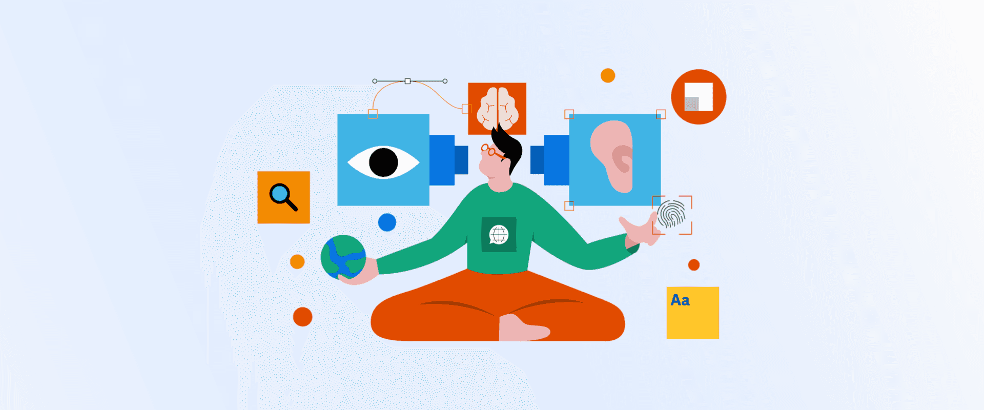
Accessibility in UI/UX
One of the most common and important things that the user sees in the app is text. It holds all of the information that the user needs to successfully interact with the app.
Sure, developers need to anticipate users setting bigger fonts when creating a layout.
But can the developers really know the full intent behind the designed element? For example, does it have an action to fulfill, what is its importance and how should it be annotated in the layout hierarchy? Most likely, no. At least, not entirely.
Therefore, accessibility support should start at the design phase.
Some of the most basic design principles that will instantly improve accessibility:
-
Colors & contrast - focus on how the app will look like if colors are inverted, possibility of setting a color theme that is also good for color impaired people. Choosing right contrast between the text and the background, e.g., light text on dark background can significantly improve readability and discoverability
-
Make sure that in layout hierarchy:
-
layout makes sense (from left to right, top to bottom, in some cases - right to left),
-
elements (e.g., buttons) are easily accessible,
-
tap areas are big enough (min. 48x48px on Android, 44x44px on iOS),
-
there is enough spacing between interactive elements (min. 8px),
-
to use single column layouts (e.g for forms - only 1 text field per row)
-
-
Scalability (responsiveness) - elements will be used on screens with different sizes and font sizes, therefore, creating a responsive layout matters greatly
-
Fonts - when creating native design for iOS should stick to Human Interface guidelines and use default fonts with Dynamic Type. For Android it's Material Design guidelines which states that fonts with scale-independent pixels (sp) should be used. In general, you should avoid using fonts with static height or width and fonts that are small to begin with
-
Elements of static height - depending on the use case, could look at a complete elimination of elements of static height, but need to keep in mind that the height of clickable elements should not be less than required by the minimum tap area
-
Describing elements - describing element importance in the layout hierarchy, element action/functionality, excluding elements from accessibility etc. For example, a shopping item image that is a clickable element should have a description of what it is and what action will happen when it's clicked (e.g., description - “Red running shoes”, action - “View image of red running shoes in full size” or “Add red running shoes to shopping cart”). In addition, it's needed for assistive voice over tools to give user audible feedback
Accessibility tools for easier UI/UX development
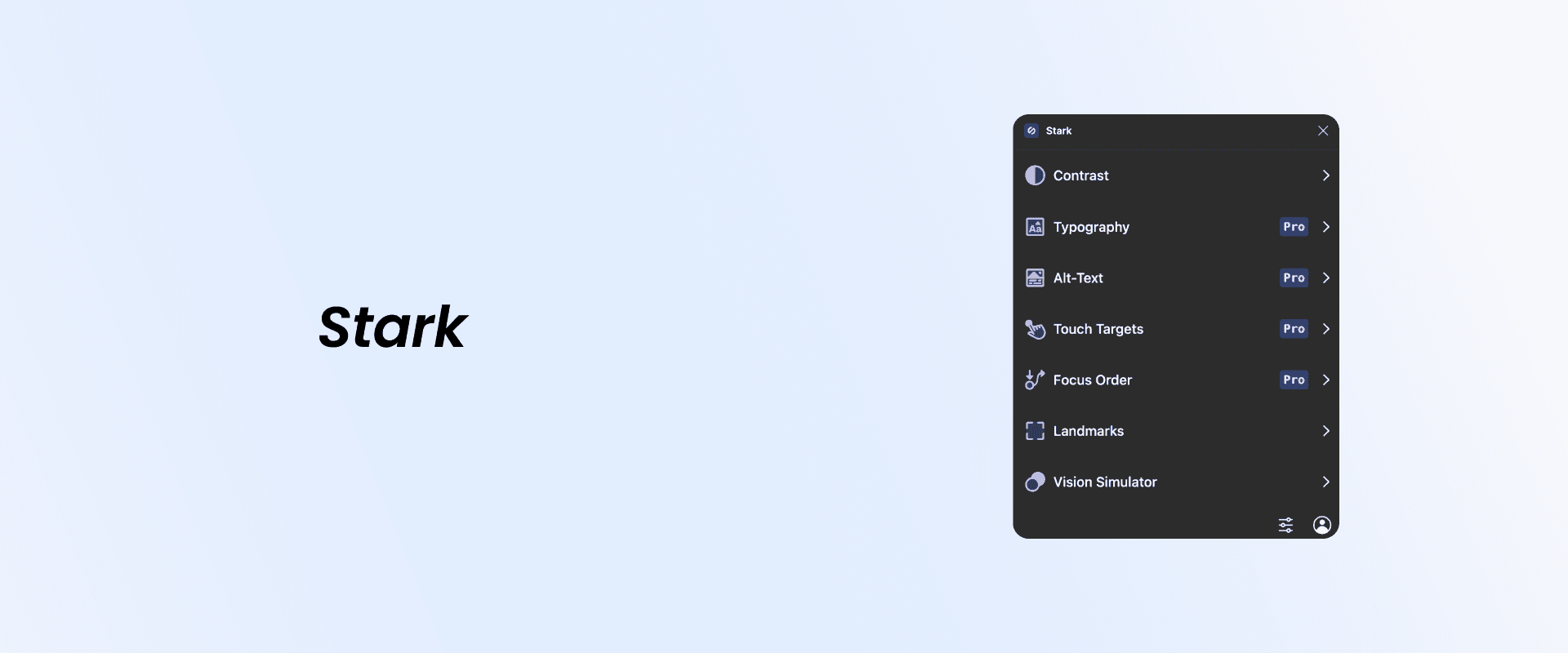
There are many tools that can be used to relieve the process of creating a UI design with accessibility in mind. Since our company uses Figma UI design tool to create amazing mobile and web designs, here are a few plugins that can be considered:
- Stark (freemium) - this plugin is a combination of many accessibility support (contrast, typography, touch targets, vision simulator etc.) tools that can be used to enhance the UI design. One of the drawbacks of this tool is that it's the only one that is not completely free. So you'd have to carefully consider if using this tool makes sense for your team or if you can suffice by combining free tools together
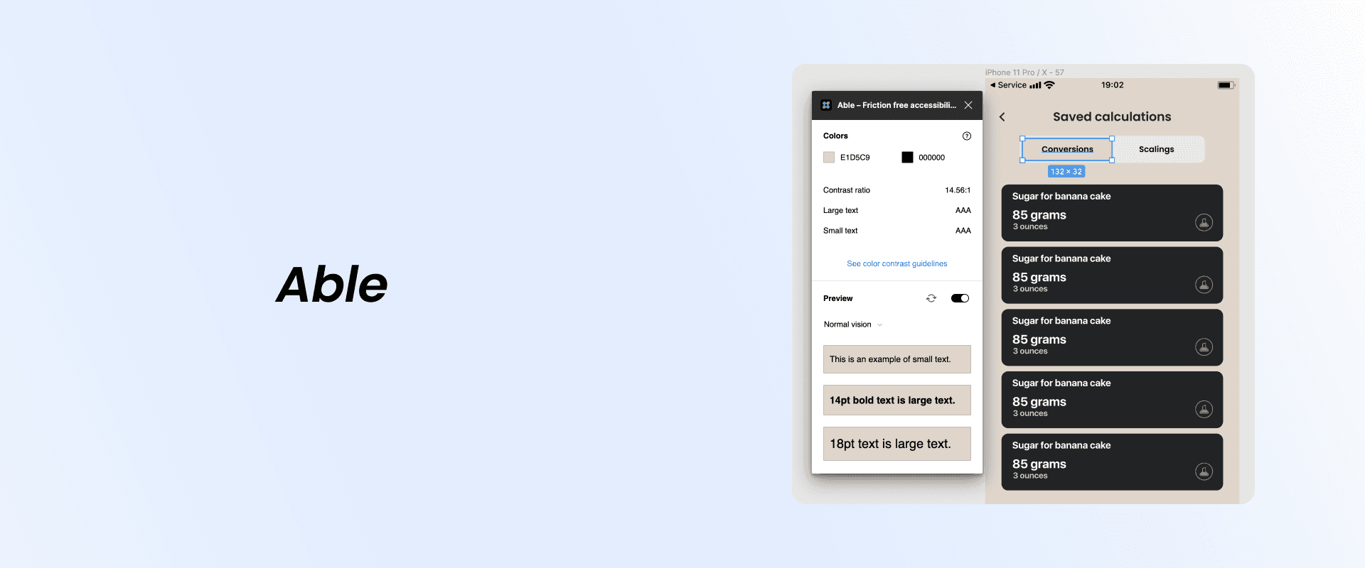
- Able (free) - it checks the contrast between 2 layers - the foreground text and colored background. It allows switching between different color deficiency modes and provides designers with contrast ratio information
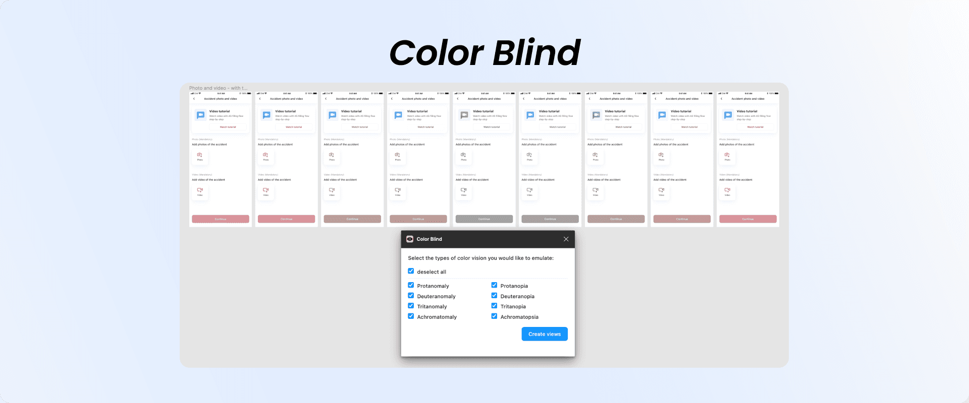
- Color blind (free) - allows to generate existing UI elements (screens, buttons and other elements) in up to 8 different types of color deficiencies. Really great tool to view side-by-side how the same exact screen will look in the eyes of people with color blindness
Make the design process smoother
-
Setting up additional typography styles - for smallest possible font size and largest (e.g., headlineSmall, headline, headlineLarge)
-
Having 3 screens (group of 6 in case of light/dark theme support) with previously mentioned typography styles. For example, one screen with typography style that has font size below default, one with the default and one above the default. This could be done in separate pages to declutter the design board, but all the screens would need to be interlinked in that case
-
Evaluate importance of text and elements beforehand (evaluation first, then designing):
-
Is it decorative or informative?
-
What is the aim of the text/element?
-
What is its relationship with other texts and elements in the layout hierarchy?
-
How important is it to the app flow? (to help users navigate through the app)
-
-
Avoiding elements of static height if the information is important. If the text that the element contains is important to the user it should not be truncated in any way
Mobile development
As developers we should strive to create “impairment-agnostic” applications, meaning that the app shouldn't know anything about how the user will interact with it, but it should support every imaginable interaction scenario, whether it's with or without the use of assistive technology.
Majority of views/elements/widgets nowadays come with already built-in accessibility support, which can be modified. But what if you want to create a completely custom component that doesn't have accessibility support out of the box? Let's find out.
Native iOS development
Implementation
Accessibility traits can be used to add accessibility support in code. Accessibility traits essentially is a system by which assistive technologies “know” how to present UI to the user.
All of the elements come with a default set of traits both in UIKit (UILabel, UIButton, UIImageView etc.) and SwiftUI (Text, Button, Image etc.). Traits can be added and/or removed based on different states to customize user experience and ensure that the app is accessible to assistive technologies, e.g., VoiceOver.
As it is with everything, you have to be careful when and where to use accessibility traits. Because using traits in inappropriate places can cause device performance issues and battery drainage (e.g. “Updates Frequently” trait that informs users that element will be polled frequently for updates).
Let's consider this conceptual example in SwiftUI of when it's appropriate to remove a trait - for buttons with images should either:
- Remove traits from image, otherwise button and image both are annotated which results in redundancy
- Add custom accessibility label
- Use meaningful image names when needed (instead of “ico_profile” use “user_profile_image” or similar)
var body: some View {
        HStack(alignment: .top, spacing: 12) {
            VStack {
                Image(image)
                    .accessibilityHidden(true)
               …
            }
        }
        .onTapGesture { handleTap() }
    }
Adding font scaling support to iOS apps
To implement font scaling support in iOS app default system font (SF Pro) with default pre-defined text styles must be used. Why is it necessary to use the default system font, you might ask? Well, it's because the default system font supports Dynamic Type out of the box and no additional setup is required.
Keep in mind that font size of default styles can’t be changed, but weight can be (medium, semibold etc.). Setting font size explicitly for default system font will nullify the Dynamic Type support, therefore making it unscalable.
Defining in UIKit
static let headline: UIFont = .preferredFont(forTextStyle: .headline)Defining in SwiftUI
static let headline: Font = .system(.headline)But what if using a custom font is a must and you still want to be able to support font scaling for accessibility purposes? No worries, it's still possible by providing the system font that it will be scaled relative to.
Defining in UIKit
static let roboto = UIFont(name: "Roboto", size: UIFont.systemFontSize)
static let defaultHeadline: UIFont = .preferredFont(forTextStyle: .headline)
static let headline: UIFont = UIFontMetrics.default.scaledFont(for: roboto ?? defaultHeadline)
Defining in SwiftUI
static let headline: Font = .custom("Roboto", size: 17, relativeTo: .headline)*Apple strongly recommends using the default system font unless the app requires custom font for branding purposes or similar. But in most cases one should stick with the default system font.
Testing accessibility support in iOS apps
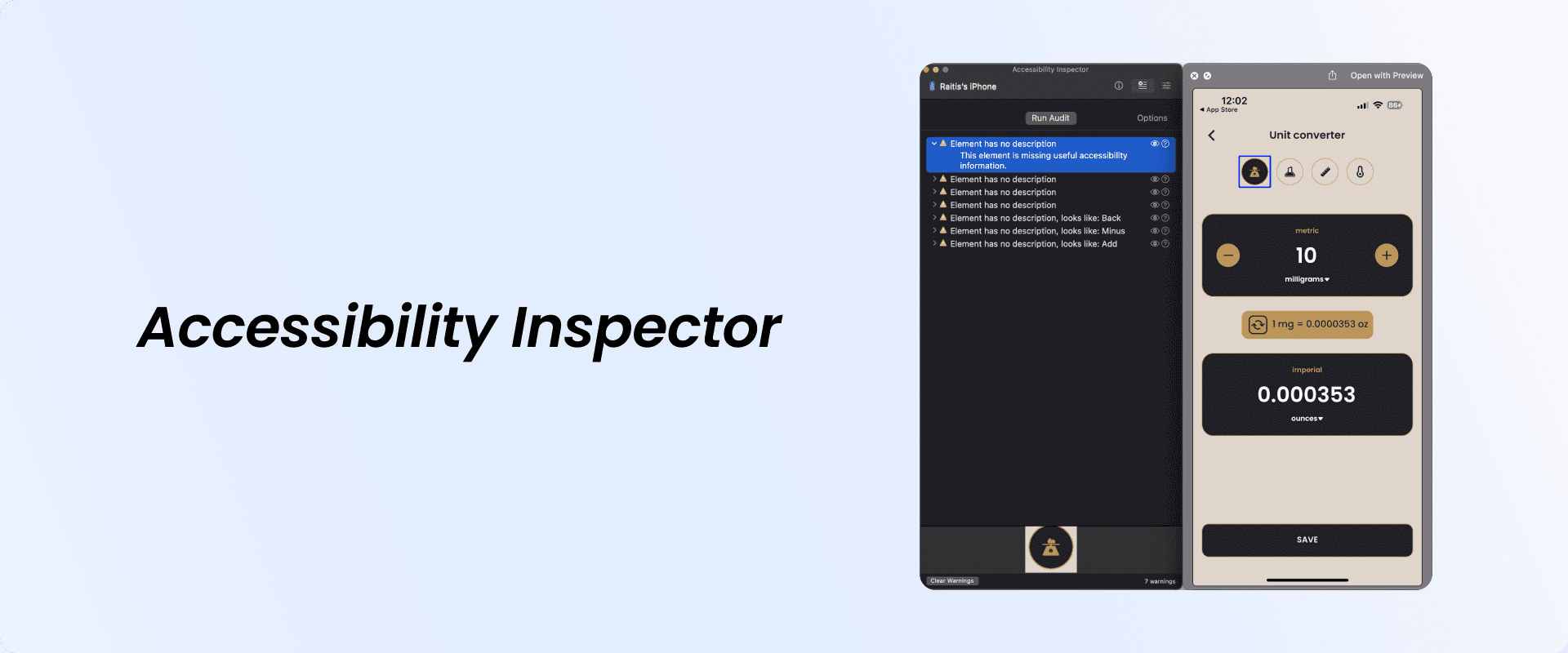
Besides basic manual testing (turning on accessibility technologies in phone settings), Apple's IDE (Integrated Development Environment) offers an accessibility auditing tool called Accessibility Inspector. What it does is it presents a utility window which displays property and value information, action methods and the position in the accessibility hierarchy of the object that mouse pointer currently is hovering over.
Another way is writing UI tests during the development phase. XCode will launch an automation runner that interacts with the app just like a person would.
class YourProjectNameUITests: XCTestCase {
    let app = XCUIApplication()

    override func setUp() {
        continueAfterFailure = false
        app.launch()
    }
}
Native Android development
Implementation
Similarly to developing iOS apps with accessibility support, for Android development there are also guidelines that should be followed to make apps more accessible for users with different disabilities:
Traditional View system with XML layouts
- Text scaling:
To support text scaling, text size can be added by specifying font size scalable pixels (sp) as opposed to density-independent pixels (dp)
<TextView
    android:layout_height="wrap_content"
    android:layout_width="match_parent"
    android:textSize="20**sp**"
android:text="@string/directions"/>- Contrast (increasing text visibility):
Text color contrasts or difference between perceived brightness between the color of the text and color of the background (behind the text) needs to be above a specific threshold. Threshold ratio is categorized the following way:

-
Control accessibility (using large & simple controls):
-
The bigger the controls are, the easier it is for the user to see and interact with them
-
Minimum recommended tap area size is 48x48dp - sum of the left padding, width and right padding & sum of the top padding, height, bottom padding is greater than or equal to 48dp
-
Padding can make the UI element appear smaller (thus visually more pleasing) while preserving the desired size of the touch area
-
<ImageButton ...
    android:paddingLeft="4dp"
    android:minWidth="40dp"
    android:paddingRight="4dp"

    android:paddingTop="8dp"
    android:minHeight="32dp"
android:paddingBottom="8dp"/>- Naming UI elements:
Giving UI elements a purposeful name that describes action/content let's users better understand what can be expected from interacting with certain elements and in general gives them context in the current screen. Can be implemented by including contentDescription or labelFor attribute (excluding TextViews).
Best practices when adding descriptions to UI elements:
-
Don't put the element's type inside the description, because screen readers automatically announce the element's type and description. Description - “Continue” not “Continue Button”
-
Each description must be unique
-
For apps with minimum SDK version set to 16+,
importantForAccessibilityattribute can be set tonoif the element is used only for decorative effect -
To indicate heading can set
accessibilityHeadingtotrue -
Adding accessibility actions (for alternate gestures to complete some action):
Implementing custom accessibility action, users can access it from the actions menu.
ViewCompat.addAccessibilityAction(
    // View to add accessibility action
    itemView,
    // Label surfaced to user by an accessibility service
    getText(R.id.archive)
) { _, _ ->
    // Same method executed when swiping on itemView
    archiveItem()
    true
}- Making accessibility actions understandable:
Making actions understandable to the user (generic announcement doesn't give the user any context about what the action does). TalkBack will announce “Double tap and hold to favorite”.
- Extending system widgets:
It's important to extend system widgets (views) when creating custom widgets to inherit all of the accessibility features that are available in the system widget
- Additional cues (other than color):
For color blind people adding additional cues to existing widgets other than color, e.g., text, icon or text in combination with icon, setting different shapes, sizes, audio or touch based haptic feedback allows to distinguish between UI elements.
-
Media accessibility support:
-
Need to include controls that allow to play, stop (additionally rewind & fast-forward), change volume and toggle captions
-
In case video contains a vital information to complete a workflow, same content needs to be provided in a type of transcript
-
Just like with the traditional View system with XML layouts, developing applications using Jetpack Compose developers must follow the same Material Design guidelines to ensure that the accessibility is supported in the app.
The main difference in Compose is that it uses Semantics to pass the information that is shown in UI elements to accessibility services. Majority of the composables (e.g., Text, Button etc.) already have built-in semantics and they fill those properties with information inferred from the composable and its children.
Setting scalable font size
@Composable
fun BigText() {
    Text("Hello World", fontSize = 30.sp)
}
Adding custom actions
...
Row(
        modifier = Modifier
            .clickable(onClick = { /* ... */ })
            .semantics {
                // Set any explicit semantic properties
                customActions = listOf(
                    CustomAccessibilityAction(actionLabel, onToggleFavorite)
                )
            }
    )
...
Testing accessibility support in Android apps
Similarly to iOS, Android apps also can be tested manually by enabling Accessibility technologies from the device Settings. Another option would be to set up linters in IDE to test for implemented accessibility features, for example, title.
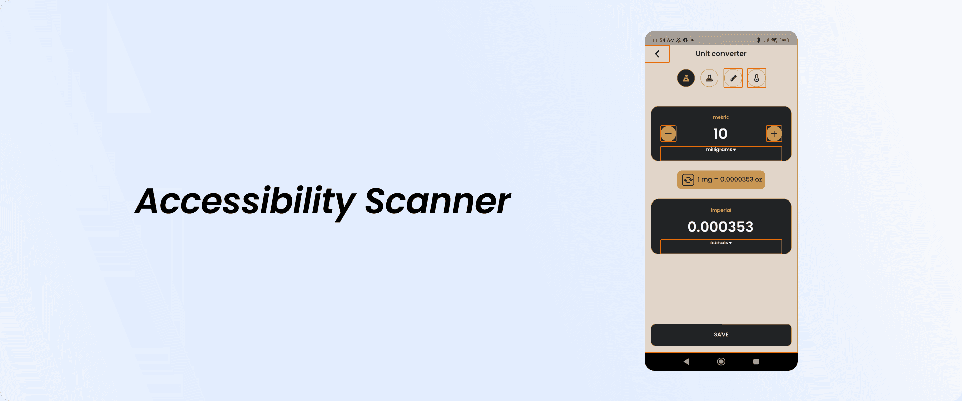
A 3rd party solution called Accessibility Scanner is available for download at Google Play Store. It's an app created by Google LLC that provides recommendations on how accessibility of the app can be improved by scanning the user interface. It can identify problem areas where accessibility can be improved, e.g., text is too small, touch area is not big enough, contrast issues and so on.
Logs provided by Google LLC's Accessibility Scanner app:
Item label
This item may not have a label readable by screen readers.

Touch target
This item's height is 37dp. Consider making the height of this touch target 48dp or larger.

Image contrast
The image's contrast ratio is 1.88. This ratio is based on an estimated foreground color of #C39550 and an estimated background color of #E1D5C9. Consider increasing this ratio to 3.00 or greater.
On Android automated UI tests can be created with, for example, Espresso testing framework:
companion object {
    @BeforeClass @JvmStatic
    fun enableAccessibilityChecks() {
        AccessibilityChecks.enable()
    }
}
Another great tool for creating UI tests in Android is Espresso Test Recorder. It lets you create UI tests without writing any code. It works by recording a test scenario from your interactions with the app to verify UI elements and snapshots of the app. Then it automatically generates a corresponding UI test based on the previously saved screen recording.
Cross-platform development with Flutter
Implementation
In case of a need to customize accessibility features for specific widgets, Flutter provides us with a Semantics widget. It is used to annotate another widget within the widget tree with a description of the meaning of the widget.
Semantics are used to give audible responses for visually impaired users of what the widget’s title is, what it will do if it’s a button, if a button is selected etc. In simple words, it means that if you want the user to know something about a specific Widget when using VoiceOver/TalkBack, it needs to be wrapped inside the Semantics widget.
Similarly to native iOS and Android, most of the Flutter widgets have already built-in [Semantics](https://api.flutter.dev/flutter/widgets/Semantics-class.html) widget, but in case there’s a need for something custom (e.g. a button), Semantics widget should be used.
There are 5 kinds of Semantics:
-
Semantics- regular/default -
MergeSemantics- to merge semantics of widget’s descendants -
ExcludeSemantics- whenever there’s a need to omit a semantic -
BlockSemantics- widgets painted before this semantic node will be omitted -
IndexedSemantics- used in Lists, for example, to avoid giving audible feedback on list separators
Semantics(
  button: true,
  label: 'Share',
  child: GestureDetector(
    onTap: onShareButtonPressed,
    child: Padding(
      padding: const EdgeInsets.only(
        left: 24,
        top: 12,
        bottom: 12,
      ),
      child: ExcludeSemantics(
        child: SvgPicture.asset(
          IconsProvider.SHARE_FILE,
        ),
      ),
    ),
  ),
)
Adding font scaling support to Flutter apps
Font scaling support in Flutter apps is enabled by default. It means that in order to use or rather keep using user’s accessibility settings, textScaleFactor cannot be set manually in code, otherwise it will override those settings. In other words, automatic text size calculations that happen in accessibility settings will be overridden by textScaleFactor that is set manually.
Testing accessibility support in Flutter apps
Pretty much the same approaches that are used testing natively can be applied when testing Flutter apps, because they're tested either on iOS or Android devices.
In addition, there is a Flutter package called accessibility_tools that allows you to visually test if the specific screen conforms to Accessibility guidelines. In a way, it works very similar to Google LLC's Accessibility Scanner that's available on Google Play Store. The main difference being that accessibility_tools can be enabled via code and you can embed the entire app within it and specify that it's only accessible in debug mode if you choose to.
The way it works is it displays a floating button with an accessibility icon at the bottom right of the screen. By pressing the button it highlights problem areas which don't fully support accessibility and logs information to your preferred IDE's console.
If the screen conforms to Accessibility guidelines that button won't be visible.
Console logs provided by accessibility_tools package:
flutter: ==========================
flutter: ACCESSIBILITY ISSUES FOUND
flutter: ==========================
flutter:
flutter: Accessibility issue 1: Tap area is missing a semantic label
flutter:
flutter: The relevant error-causing widget was:
flutter: RawMaterialButton
flutter:
flutter: Accessibility issue 2: Tap area of 40x40 is too small:
flutter: should be at least 48x48
flutter:
flutter: The relevant error-causing widget was:
flutter: GestureDetector
...
Just like in native iOS and Android, also in Flutter you can write automated tests. But with Flutter you don't necessarily have to write UI tests, because there are unit tests that can test if the Widget meets the accessibility requirements:
testWidgets('HomePage meets androidTapTargetGuideline', (WidgetTester tester) async {
  final SemanticsHandle handle = tester.ensureSemantics();
  await tester.pumpWidget(const MaterialApp(home: HomePage()));
  await expectLater(tester, meetsGuideline(androidTapTargetGuideline));
  handle.dispose();
});
Assuring the quality of implemented accessibility features
The most important part after app development and before app release is assuring the quality of the app and its functionality. Not a single app should skip the process of QA (quality assurance) to avoid weird bugs in production and unpleasant feedback from the users.
When it comes to testing accessibility support, it poses some new challenges for Quality Assurance specialists. First of all, QAs must verify that the app is made fully accessible to users with disabilities by making sure that it conforms to accessibility guidelines. Secondly, the app needs to pass the actual usability test, which is the hard part, because it's more difficult to anticipate interaction approaches and habits of users with disabilities.
Testing accessibility support
Obviously, with added functionality comes more testing (more features = more testing), but from a QAs perspective that's a good thing, right? Right?
Let's take a quick look at the minimum requirements of what QA specialists would be required to do to additionally test the app for accessibility support:
-
For visual testing it would be necessary to test the app with system font size set below default, default and above default to see how well elements are resizing, how readable the text is and how usable the app itself is (probably shouldn't go through all of them, but 3 below and 3 above). Settings that have font size smaller than the default most of the time won’t cause any issues, but anything bigger than the default might and most likely will if not handled properly
-
Using IDE's built-in accessibility support tools like Accessibility Inspector on XCode (great thing about this tool is that in case the QA process in your team is set up the black box way where testers don't have the access to the source code, they still can use it for testing by launching Accessibility Inspector from XCode, connecting device to the computer and setting it as a target). Pretty cool, isn't it?
-
Using 3rd party applications to test accessibility compliance (on Android devices)
-
Testing using built-in accessibility technologies in the device - VoiceOver/TalkBack, VoiceControl, InvertColors and other accessibility technologies
-
Automated accessibility tests can be be set up via your CI/CD pipeline to automatically run tests to test for accessibility support and generate reports with the issues (if there are any)
But remember, although QAs are directly responsible for testing the accessibility support in apps, the whole weight of responsibility of ensuring compliance with accessibility guidelines shouldn’t be put on their shoulders alone. The whole team should be responsible for validating accessibility features in the app - from designers all the way to the testers.
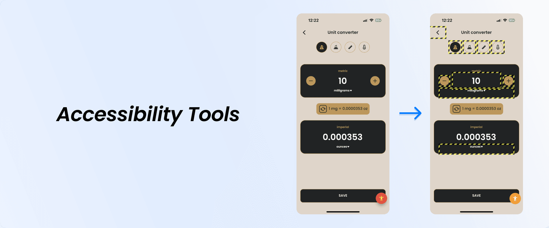
Testing accessibility support on mobile devices
Since there are no 3rd party apps available on iOS, the only way to test it is by enabling any of the accessibility technologies within the phone settings:
-
VoiceOver
-
Dynamic Type
-
Switch Control
-
Voice Control
-
Classic/Smart Invert
And just like on iOS devices, devices that run on Android operating system support enabling accessibility technologies within the phone settings:
-
TalkBack
-
Font size
-
Voice Access
-
Color inversion
-
Explore by Touch
And by using 3rd party apps like Accessibility Scanner that's available on Google Play Store. It takes screenshots highlighting problem areas and provides logs with the problem category, element identifier and detailed description of what is wrong and what needs to be fixed.
Additionally, the UI testing of light/dark themes with low/medium/max brightness settings in different lighting conditions could be performed. Preferably it would be done by multiple testers, because just like in the real world, vision and viewing conditions differ from user to user.
But take this with a grain of salt, because you should decide for yourself what makes sense for your team in terms of Quality Assurance. My goal is to provide an insight of what could be applied to existing QA processes.
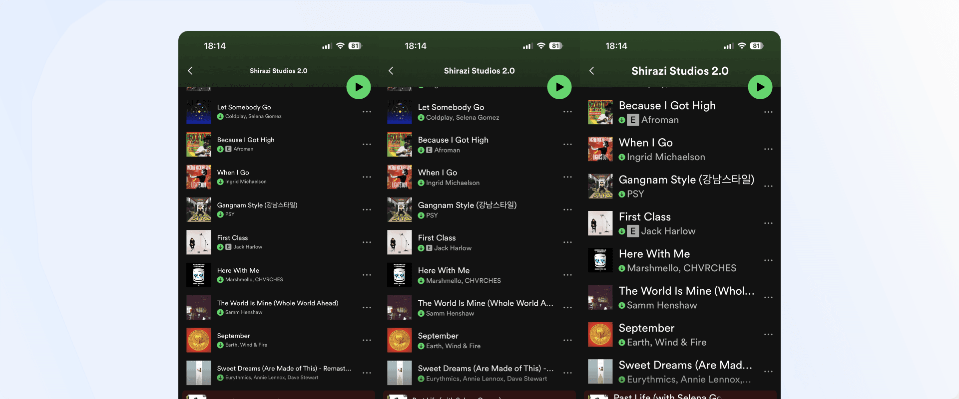
Apps that have successfully adapted accessibility support
Let's take a quick look at a few good examples of how app giants Twitter and Spotify have handled font size scalability in their iOS apps.
Spotify
Final thoughts
There is a myth that accessibility is expensive to implement into a project and might be considered as an “extra”. Let me tell you that it's actually not, well in some cases it can be true, but I'll get to that later.
Since the majority of native widgets in either development technology stack come with already integrated Accessibility support (to an extent), fine tuning accessibility support by setting custom semantics/traits (labels, descriptions, element types) isn't too time consuming and can be done during the development phase.
I hope you learned something new and will consider implementing some of the things in your development processes.
You can find me on Twitter and share your feedback!
— Raitis ☘️